import os

from IPython.display import HTML
from itables import to_html_datatable
import matplotlib.colors as mcolors
import numpy as np
import pandas as pd
import plotly.express as px
import plotly.graph_objects as go
import scipy.stats as stTables and figures
Learning objectives:
- Recognise importance of sharing code for creation of tables and figures.
- View some example tables and figures.
Relevant reproducibility guidelines:
- STARS Reproducibility Recommendations (⭐): Include code to generate the tables, figures, and other reported results.
- STARS Reproducibility Recommendations: Save outputs to a file.
Pre-reading:
This page uses the results saved on the Scenario and sensitivity analysis page.
Required packages:
These should be available from environment setup in the “Test yourself” section of Environments.
library(dplyr)
library(ggplot2)
library(kableExtra)
library(knitr)
When reporting results from a simulation, you will usually include tables and figures. To make your work reproducible, you should:
1. Make your tables and figures using code.
2. Share that code alongside your results.
This is just as important as sharing model and scenario code. In Heather et al. (2025), only one study included the code needed to generate all its reported results. Without this code for the others, recreating outputs was time-consuming and challenging. It required guesswork about which results to extract, how to clean them, and what processing steps were taken when producing the published tables and figures.
This page will show some examples of creating tables and figures, but there are many different ways you could describe and visualise your simulation results. The key takeaway from the page is simple: write code and share it!
Simulation results
This page will use the results saved on the Scenario and sensitivity analysis page.
Scenario analysis
scenario = pd.read_csv("scenarios_resources/python_scenario_results.csv")
HTML(to_html_datatable(scenario.head(200)))| Loading ITables v2.5.2 from the internet... (need help?) |
Sensitivity analysis
sensitivity = pd.read_csv("scenarios_resources/python_sensitivity_results.csv")
HTML(to_html_datatable(sensitivity.head(200)))| Loading ITables v2.5.2 from the internet... (need help?) |
Scenario analysis
scenario <- read.csv(file.path("scenarios_resources", "r_scenario_results.csv"))
kable(scenario) |> scroll_box(height = "400px")| X | replication | arrivals | mean_wait_time_doctor | mean_time_with_doctor | utilisation_doctor | mean_queue_length_doctor | mean_time_in_system | mean_patients_in_system | scenario | interarrival_time | number_of_doctors |
|---|---|---|---|---|---|---|---|---|---|---|---|
| 1 | 1 | 8 | 0.0000000 | 10.626767 | 0.4811191 | 0.0000000 | 5.909446 | 1.5730708 | 1 | 4 | 3 |
| 2 | 2 | 14 | 1.3489715 | 16.474475 | 0.8415543 | 1.4037854 | 6.529895 | 4.0585764 | 1 | 4 | 3 |
| 3 | 3 | 8 | 3.3185568 | 12.576986 | 0.9214641 | 0.6425483 | 14.293369 | 2.4214309 | 1 | 4 | 3 |
| 4 | 4 | 9 | 7.0789803 | 8.229096 | 1.0000000 | 1.9960925 | 14.810041 | 3.2462020 | 1 | 4 | 3 |
| 5 | 5 | 11 | 11.8431217 | 8.866916 | 1.0000000 | 2.9270728 | 16.007073 | 4.2730406 | 1 | 4 | 3 |
| 6 | 1 | 9 | 1.1561321 | 12.600360 | 0.7545527 | 0.3739683 | 6.972457 | 2.4937655 | 2 | 5 | 3 |
| 7 | 2 | 10 | 0.2185845 | 15.462225 | 0.8137894 | 0.7190226 | 7.019465 | 3.0715488 | 2 | 5 | 3 |
| 8 | 3 | 8 | 1.6612341 | 11.704709 | 0.8144131 | 0.2671798 | 10.033307 | 1.7999155 | 2 | 5 | 3 |
| 9 | 4 | 4 | 1.3862671 | 8.268402 | 0.5633356 | 0.9223766 | 8.714268 | 0.8490077 | 2 | 5 | 3 |
| 10 | 5 | 7 | 1.1383003 | 8.211288 | 0.8027837 | 0.1753468 | 8.159880 | 1.5179933 | 2 | 5 | 3 |
| 11 | 1 | 4 | 0.0000000 | 16.756011 | 0.5829234 | 0.0000000 | 7.594901 | 1.6885375 | 3 | 6 | 3 |
| 12 | 2 | 7 | 0.0000000 | 13.951263 | 0.6247704 | 0.0000000 | 9.878982 | 1.8347756 | 3 | 6 | 3 |
| 13 | 3 | 11 | 0.0000000 | 10.642901 | 0.6696266 | 0.0000000 | 5.471170 | 2.1742571 | 3 | 6 | 3 |
| 14 | 4 | 5 | 2.1255795 | 7.962361 | 0.4490071 | 0.2915664 | 10.087940 | 1.3321312 | 3 | 6 | 3 |
| 15 | 5 | 6 | 0.1698502 | 7.931855 | 0.6664404 | 0.0000000 | 7.985399 | 0.9107067 | 3 | 6 | 3 |
| 16 | 1 | 5 | 0.0000000 | 14.928869 | 0.5309547 | 0.0000000 | 8.986369 | 1.5562112 | 4 | 7 | 3 |
| 17 | 2 | 5 | 0.0000000 | 16.557442 | 0.4795871 | 0.0000000 | 9.466947 | 1.2655765 | 4 | 7 | 3 |
| 18 | 3 | 8 | 0.0000000 | 10.066787 | 0.5494173 | 0.0000000 | 3.468666 | 2.0459750 | 4 | 7 | 3 |
| 19 | 4 | 5 | 0.9021887 | 7.962361 | 0.4504371 | 0.3962059 | 8.864549 | 1.3634454 | 4 | 7 | 3 |
| 20 | 5 | 4 | 0.0000000 | 8.753199 | 0.3340787 | 0.0000000 | 7.926292 | 0.8053229 | 4 | 7 | 3 |
| 21 | 1 | 3 | 0.0000000 | 20.737360 | 0.4033890 | 0.0000000 | 8.986369 | 1.2630193 | 5 | 8 | 3 |
| 22 | 2 | 5 | 0.0000000 | 16.557442 | 0.4525148 | 0.0000000 | 9.466947 | 1.1847657 | 5 | 8 | 3 |
| 23 | 3 | 7 | 0.0000000 | 11.304930 | 0.4485586 | 0.0000000 | 3.882443 | 1.8976861 | 5 | 8 | 3 |
| 24 | 4 | 6 | 0.0000000 | 6.932281 | 0.3689745 | 0.0000000 | 4.751341 | 1.0837230 | 5 | 8 | 3 |
| 25 | 5 | 3 | 0.0000000 | 9.563759 | 0.2902283 | 0.0000000 | 7.926292 | 0.5974274 | 5 | 8 | 3 |
| 26 | 1 | 11 | 0.2873017 | 8.979263 | 0.7388989 | 0.0000000 | 5.072421 | 2.0511195 | 6 | 4 | 4 |
| 27 | 2 | 7 | 0.0000000 | 11.322431 | 0.5589778 | 0.0000000 | 5.722932 | 1.9471475 | 6 | 4 | 4 |
| 28 | 3 | 10 | 0.3279443 | 13.891435 | 0.8192434 | 0.0000000 | 11.073710 | 2.3708711 | 6 | 4 | 4 |
| 29 | 4 | 6 | 0.0000000 | 7.155858 | 0.3352238 | 0.0000000 | 6.212797 | 0.9218882 | 6 | 4 | 4 |
| 30 | 5 | 8 | 0.0000000 | 9.299128 | 0.3465470 | 0.0000000 | 7.062117 | 1.6075429 | 6 | 4 | 4 |
| 31 | 1 | 9 | 0.0000000 | 14.361497 | 0.5564580 | 0.0000000 | 5.909446 | 2.0694053 | 7 | 5 | 4 |
| 32 | 2 | 8 | 0.0000000 | 10.902873 | 0.5209432 | 0.0000000 | 5.040122 | 1.6635569 | 7 | 5 | 4 |
| 33 | 3 | 8 | 0.1002196 | 12.491221 | 0.7258143 | 0.0000000 | 8.233837 | 1.9542346 | 7 | 5 | 4 |
| 34 | 4 | 5 | 0.0000000 | 7.220270 | 0.3280956 | 0.0000000 | 8.605687 | 0.8995180 | 7 | 5 | 4 |
| 35 | 5 | 5 | 0.0000000 | 7.764737 | 0.2639238 | 0.0000000 | 7.764737 | 0.9782088 | 7 | 5 | 4 |
| 36 | 1 | 4 | 0.0000000 | 16.756011 | 0.4371926 | 0.0000000 | 7.594901 | 1.6885375 | 8 | 6 | 4 |
| 37 | 2 | 7 | 0.0000000 | 13.951263 | 0.4685778 | 0.0000000 | 9.878982 | 1.8347756 | 8 | 6 | 4 |
| 38 | 3 | 11 | 0.0000000 | 10.921073 | 0.5067605 | 0.0000000 | 5.471170 | 2.1742571 | 8 | 6 | 4 |
| 39 | 4 | 6 | 0.0000000 | 6.932281 | 0.3478921 | 0.0000000 | 6.932281 | 1.0897496 | 8 | 6 | 4 |
| 40 | 5 | 4 | 0.0000000 | 8.753199 | 0.2551105 | 0.0000000 | 7.926292 | 0.9878955 | 8 | 6 | 4 |
| 41 | 1 | 5 | 0.0000000 | 14.928869 | 0.3982160 | 0.0000000 | 8.986369 | 1.5562112 | 9 | 7 | 4 |
| 42 | 2 | 5 | 0.0000000 | 16.557442 | 0.3596903 | 0.0000000 | 9.466947 | 1.2655765 | 9 | 7 | 4 |
| 43 | 3 | 8 | 0.0000000 | 10.066787 | 0.4120630 | 0.0000000 | 3.468666 | 2.0459750 | 9 | 7 | 4 |
| 44 | 4 | 6 | 0.0000000 | 6.932281 | 0.3489646 | 0.0000000 | 6.932281 | 1.2656769 | 9 | 7 | 4 |
| 45 | 5 | 4 | 0.0000000 | 7.539044 | 0.2003486 | 0.0000000 | 5.772494 | 0.5339783 | 9 | 7 | 4 |
| 46 | 1 | 3 | 0.0000000 | 20.737360 | 0.3025417 | 0.0000000 | 8.986369 | 1.2630193 | 10 | 8 | 4 |
| 47 | 2 | 5 | 0.0000000 | 16.557442 | 0.3393861 | 0.0000000 | 9.466947 | 1.1847657 | 10 | 8 | 4 |
| 48 | 3 | 7 | 0.0000000 | 11.304930 | 0.3364190 | 0.0000000 | 3.882443 | 1.8976861 | 10 | 8 | 4 |
| 49 | 4 | 6 | 0.0000000 | 6.932281 | 0.2767308 | 0.0000000 | 4.751341 | 1.0837230 | 10 | 8 | 4 |
| 50 | 5 | 4 | 0.0000000 | 7.437496 | 0.1859374 | 0.0000000 | 7.437496 | 0.8162890 | 10 | 8 | 4 |
| 51 | 1 | 13 | 0.1711051 | 9.688685 | 0.6289244 | 0.0403352 | 5.063579 | 2.2831273 | 11 | 4 | 5 |
| 52 | 2 | 7 | 0.0000000 | 11.322431 | 0.4471823 | 0.0000000 | 5.722932 | 1.9471475 | 11 | 4 | 5 |
| 53 | 3 | 11 | 0.1017516 | 14.993140 | 0.7521643 | 0.0000000 | 11.329369 | 2.7976261 | 11 | 4 | 5 |
| 54 | 4 | 6 | 0.0000000 | 7.155858 | 0.2681790 | 0.0000000 | 6.212797 | 0.9218882 | 11 | 4 | 5 |
| 55 | 5 | 8 | 0.0000000 | 9.299128 | 0.2772376 | 0.0000000 | 7.062117 | 1.6075429 | 11 | 4 | 5 |
| 56 | 1 | 9 | 0.0000000 | 14.361497 | 0.4451664 | 0.0000000 | 5.909446 | 2.0694053 | 12 | 5 | 5 |
| 57 | 2 | 8 | 0.0000000 | 10.902873 | 0.4167546 | 0.0000000 | 5.040122 | 1.6635569 | 12 | 5 | 5 |
| 58 | 3 | 8 | 0.0000000 | 13.200172 | 0.5846602 | 0.0000000 | 8.233837 | 1.9542346 | 12 | 5 | 5 |
| 59 | 4 | 5 | 0.0000000 | 7.220270 | 0.2624765 | 0.0000000 | 8.605687 | 0.8995180 | 12 | 5 | 5 |
| 60 | 5 | 5 | 0.0000000 | 7.764737 | 0.2111390 | 0.0000000 | 7.764737 | 0.9782088 | 12 | 5 | 5 |
| 61 | 1 | 4 | 0.0000000 | 16.756011 | 0.3497540 | 0.0000000 | 7.594901 | 1.6885375 | 13 | 6 | 5 |
| 62 | 2 | 7 | 0.0000000 | 13.951263 | 0.3748622 | 0.0000000 | 9.878982 | 1.8347756 | 13 | 6 | 5 |
| 63 | 3 | 11 | 0.0000000 | 10.921073 | 0.4054084 | 0.0000000 | 5.471170 | 2.1742571 | 13 | 6 | 5 |
| 64 | 4 | 6 | 0.0000000 | 6.932281 | 0.2783137 | 0.0000000 | 6.932281 | 1.0897496 | 13 | 6 | 5 |
| 65 | 5 | 4 | 0.0000000 | 8.753199 | 0.2040884 | 0.0000000 | 7.926292 | 0.9878955 | 13 | 6 | 5 |
| 66 | 1 | 5 | 0.0000000 | 14.928869 | 0.3185728 | 0.0000000 | 8.986369 | 1.5562112 | 14 | 7 | 5 |
| 67 | 2 | 5 | 0.0000000 | 16.557442 | 0.2877523 | 0.0000000 | 9.466947 | 1.2655765 | 14 | 7 | 5 |
| 68 | 3 | 8 | 0.0000000 | 10.066787 | 0.3296504 | 0.0000000 | 3.468666 | 2.0459750 | 14 | 7 | 5 |
| 69 | 4 | 6 | 0.0000000 | 6.932281 | 0.2791717 | 0.0000000 | 6.932281 | 1.2656769 | 14 | 7 | 5 |
| 70 | 5 | 4 | 0.0000000 | 7.539044 | 0.1602788 | 0.0000000 | 5.772494 | 0.5339783 | 14 | 7 | 5 |
| 71 | 1 | 3 | 0.0000000 | 20.737360 | 0.2420334 | 0.0000000 | 8.986369 | 1.2630193 | 15 | 8 | 5 |
| 72 | 2 | 5 | 0.0000000 | 16.557442 | 0.2715089 | 0.0000000 | 9.466947 | 1.1847657 | 15 | 8 | 5 |
| 73 | 3 | 7 | 0.0000000 | 11.304930 | 0.2691352 | 0.0000000 | 3.882443 | 1.8976861 | 15 | 8 | 5 |
| 74 | 4 | 6 | 0.0000000 | 6.932281 | 0.2213847 | 0.0000000 | 4.751341 | 1.0837230 | 15 | 8 | 5 |
| 75 | 5 | 4 | 0.0000000 | 7.437496 | 0.1487499 | 0.0000000 | 7.437496 | 0.8162890 | 15 | 8 | 5 |
Sensitivity analysis
sensitivity <- read.csv(
  file.path("scenarios_resources", "r_sensitivity_results.csv")
)
kable(sensitivity) |> scroll_box(height = "400px")| X | replication | arrivals | mean_wait_time_doctor | mean_time_with_doctor | utilisation_doctor | mean_queue_length_doctor | mean_time_in_system | mean_patients_in_system | scenario | interarrival_time |
|---|---|---|---|---|---|---|---|---|---|---|
| 1 | 1 | 8 | 0.0000000 | 10.626767 | 0.4811191 | 0.0000000 | 5.909446 | 1.5730708 | 1 | 4.0 |
| 2 | 2 | 14 | 1.3489715 | 16.474475 | 0.8415543 | 1.4037854 | 6.529895 | 4.0585764 | 1 | 4.0 |
| 3 | 3 | 8 | 3.3185568 | 12.576986 | 0.9214641 | 0.6425483 | 14.293369 | 2.4214309 | 1 | 4.0 |
| 4 | 4 | 9 | 7.0789803 | 8.229096 | 1.0000000 | 1.9960925 | 14.810041 | 3.2462020 | 1 | 4.0 |
| 5 | 5 | 11 | 11.8431217 | 8.866916 | 1.0000000 | 2.9270728 | 16.007073 | 4.2730406 | 1 | 4.0 |
| 6 | 1 | 11 | 4.4136200 | 10.968638 | 0.9305843 | 0.9874912 | 10.970224 | 3.2130228 | 2 | 4.5 |
| 7 | 2 | 10 | 4.2952348 | 11.628385 | 0.8801942 | 1.1333248 | 10.737537 | 3.5719202 | 2 | 4.5 |
| 8 | 3 | 8 | 6.3476572 | 13.246809 | 0.9553582 | 1.1892971 | 16.012763 | 3.1906477 | 2 | 4.5 |
| 9 | 4 | 4 | 1.6258165 | 9.999398 | 0.6295231 | 2.1705516 | 8.013161 | 0.7738957 | 2 | 4.5 |
| 10 | 5 | 7 | 1.4030508 | 7.662403 | 0.7949871 | 0.1776756 | 8.671934 | 1.8245624 | 2 | 4.5 |
| 11 | 1 | 9 | 1.1561321 | 12.600360 | 0.7545527 | 0.3739683 | 6.972457 | 2.4937655 | 3 | 5.0 |
| 12 | 2 | 10 | 0.2185845 | 15.462225 | 0.8137894 | 0.7190226 | 7.019465 | 3.0715488 | 3 | 5.0 |
| 13 | 3 | 8 | 1.6612341 | 11.704709 | 0.8144131 | 0.2671798 | 10.033307 | 1.7999155 | 3 | 5.0 |
| 14 | 4 | 4 | 1.3862671 | 8.268402 | 0.5633356 | 0.9223766 | 8.714268 | 0.8490077 | 3 | 5.0 |
| 15 | 5 | 7 | 1.1383003 | 8.211288 | 0.8027837 | 0.1753468 | 8.159880 | 1.5179933 | 3 | 5.0 |
| 16 | 1 | 8 | 0.0000000 | 13.183604 | 0.6555458 | 0.0736313 | 7.594901 | 2.0286140 | 4 | 5.5 |
| 17 | 2 | 6 | 0.0000000 | 14.204232 | 0.6476341 | 0.0000000 | 8.061193 | 1.7041228 | 4 | 5.5 |
| 18 | 3 | 9 | 1.0701721 | 10.484981 | 0.7546664 | 0.2840460 | 7.720035 | 2.5252492 | 4 | 5.5 |
| 19 | 4 | 8 | 1.6097542 | 12.349744 | 0.6931755 | 0.2616702 | 7.074266 | 2.0253240 | 4 | 5.5 |
| 20 | 5 | 7 | 0.6407407 | 8.647519 | 0.7528266 | 0.0000000 | 7.929976 | 1.3341535 | 4 | 5.5 |
| 21 | 1 | 4 | 0.0000000 | 16.756011 | 0.5829234 | 0.0000000 | 7.594901 | 1.6885375 | 5 | 6.0 |
| 22 | 2 | 7 | 0.0000000 | 13.951263 | 0.6247704 | 0.0000000 | 9.878982 | 1.8347756 | 5 | 6.0 |
| 23 | 3 | 11 | 0.0000000 | 10.642901 | 0.6696266 | 0.0000000 | 5.471170 | 2.1742571 | 5 | 6.0 |
| 24 | 4 | 5 | 2.1255795 | 7.962361 | 0.4490071 | 0.2915664 | 10.087940 | 1.3321312 | 5 | 6.0 |
| 25 | 5 | 6 | 0.1698502 | 7.931855 | 0.6664404 | 0.0000000 | 7.985399 | 0.9107067 | 5 | 6.0 |
| 26 | 1 | 5 | 0.0000000 | 14.928869 | 0.5671720 | 0.0000000 | 7.601250 | 1.5875062 | 6 | 6.5 |
| 27 | 2 | 6 | 0.0000000 | 15.719055 | 0.5351976 | 0.0000000 | 12.100828 | 1.5937329 | 6 | 6.5 |
| 28 | 3 | 8 | 0.0000000 | 10.066787 | 0.5907619 | 0.0000000 | 5.471170 | 2.0509018 | 6 | 6.5 |
| 29 | 4 | 5 | 1.5138841 | 7.962361 | 0.4497221 | 0.3399041 | 9.476245 | 1.3465966 | 6 | 6.5 |
| 30 | 5 | 5 | 0.0046527 | 13.128797 | 0.6221594 | 0.0000000 | 13.133450 | 1.7319608 | 6 | 6.5 |
| 31 | 1 | 5 | 0.0000000 | 14.928869 | 0.5309547 | 0.0000000 | 8.986369 | 1.5562112 | 7 | 7.0 |
| 32 | 2 | 5 | 0.0000000 | 16.557442 | 0.4795871 | 0.0000000 | 9.466947 | 1.2655765 | 7 | 7.0 |
| 33 | 3 | 8 | 0.0000000 | 10.066787 | 0.5494173 | 0.0000000 | 3.468666 | 2.0459750 | 7 | 7.0 |
| 34 | 4 | 5 | 0.9021887 | 7.962361 | 0.4504371 | 0.3962059 | 8.864549 | 1.3634454 | 7 | 7.0 |
| 35 | 5 | 4 | 0.0000000 | 8.753199 | 0.3340787 | 0.0000000 | 7.926292 | 0.8053229 | 7 | 7.0 |
Example tables
This function finds the average results from each experiment.
It uses the summary_stats() function introduced on the Replications page.
NoteView
summary_stats()
def summary_stats(data):
    """
    Calculate mean, standard deviation and 95% confidence interval (CI).

    Parameters
    ----------
    data : pd.Series
        Data to use in calculation.

    Returns
    -------
    tuple
        (mean, standard deviation, CI lower, CI upper).
    """
    # Remove any NaN from the series
    data = data.dropna()

    # Find number of observations
    count = len(data)

    # If there are no observations, then set all to NaN
    if count == 0:
        mean, std_dev, ci_lower, ci_upper = np.nan, np.nan, np.nan, np.nan
    # If there is only one or two observations, can do mean but not others
    elif count < 3:
        mean = data.mean()
        std_dev, ci_lower, ci_upper = np.nan, np.nan, np.nan
    # With more than one observation, can calculate all...
    else:
        mean = data.mean()
        std_dev = data.std()
        # Special case for CI if variance is 0
        if np.var(data) == 0:
            ci_lower, ci_upper = mean, mean
        else:
            # Calculation of CI uses t-distribution, which is suitable for
            # smaller sample sizes (n<30)
            ci_lower, ci_upper = st.t.interval(
                confidence=0.95,
                df=count-1,
                loc=mean,
                scale=st.sem(data))
    return mean, std_dev, ci_lower, ci_upper
def summarise_scenarios(results, groups, result_vars, path_prefix=None):
"""
Find the average results from each scenario for multiple metrics.
Parameters
----------
results : pd.DataFrame
Run-level results from every scenario.
groups : list
List of columns to group by (provided as strings).
result_vars : list
List of performance measures to get results on (provided as strings).
path_prefix : str, optional
Path prefix to save tables to. Each metric will be saved as
{path_prefix}_{metric}.csv
Returns
-------
summary_tables : dict
Dictionary with metric names as keys and summary DataFrames as values.
"""
summary_tables = {}
for result_var in result_vars:
summary_table = (
results.groupby(groups)[result_var]
.apply(summary_stats)
.apply(pd.Series)
.reset_index()
)
summary_table.columns = (
list(summary_table.columns[:-4]) +
["mean", "std_dev", "ci_lower", "ci_upper"]
)
# Add column to identify which metric this is
summary_table["metric"] = result_var
summary_tables[result_var] = summary_table
# Save if path provided
if path_prefix:
output_path = f"{path_prefix}_{result_var}.csv"
summary_table.to_csv(output_path, index=False)
return summary_tablesScenario analysis
result_variables = [
    "mean_wait_time",
    "mean_utilisation_tw",
    "mean_queue_length",
    "mean_time_in_system",
    "mean_patients_in_system"
]
scenario_tables = summarise_scenarios(
results=scenario,
groups=["scenario", "interarrival_time", "number_of_doctors"],
result_vars=result_variables,
path_prefix=os.path.join("tables_figures_resources", "python_scenario")
)HTML(to_html_datatable(scenario_tables["mean_wait_time"]))| Loading ITables v2.5.2 from the internet... (need help?) |
HTML(to_html_datatable(scenario_tables["mean_utilisation_tw"]))| Loading ITables v2.5.2 from the internet... (need help?) |
HTML(to_html_datatable(scenario_tables["mean_queue_length"]))| Loading ITables v2.5.2 from the internet... (need help?) |
HTML(to_html_datatable(scenario_tables["mean_time_in_system"]))| Loading ITables v2.5.2 from the internet... (need help?) |
HTML(to_html_datatable(scenario_tables["mean_patients_in_system"]))| Loading ITables v2.5.2 from the internet... (need help?) |
Sensitivity analysis
sensitivity_tables = summarise_scenarios(
    results=sensitivity,
    groups=["scenario", "interarrival_time"],
    result_vars=result_variables,
    path_prefix=os.path.join("tables_figures_resources", "python_sensitivity")
)HTML(to_html_datatable(sensitivity_tables["mean_wait_time"]))| Loading ITables v2.5.2 from the internet... (need help?) |
HTML(to_html_datatable(sensitivity_tables["mean_utilisation_tw"]))| Loading ITables v2.5.2 from the internet... (need help?) |
HTML(to_html_datatable(sensitivity_tables["mean_queue_length"]))| Loading ITables v2.5.2 from the internet... (need help?) |
HTML(to_html_datatable(sensitivity_tables["mean_time_in_system"]))| Loading ITables v2.5.2 from the internet... (need help?) |
HTML(to_html_datatable(sensitivity_tables["mean_patients_in_system"]))| Loading ITables v2.5.2 from the internet... (need help?) |
#' Summarise multiple performance measures at once
#'
#' @param results Dataframe with results from each replication of scenarios.
#' @param groups Vector of grouping columns (as strings).
#' @param result_vars Vector of performance measures to summarise (as strings).
#' @param path_prefix Optional path prefix to save each table to.
#'
#' @return A named list of summary data frames.

summarise_scenarios <- function(
  results, groups, result_vars, path_prefix = NULL
) {
  summary_tables <- list()

  for (result_var in result_vars) {
    summary_table <- results |>
      group_by(across(all_of(groups))) |>
      summarise(
        mean = mean(.data[[result_var]], na.rm = TRUE),
        std_dev = sd(.data[[result_var]], na.rm = TRUE),
        ci_lower = t.test(.data[[result_var]])$conf.int[1L],
        ci_upper = t.test(.data[[result_var]])$conf.int[2L],
        .groups = "drop"
      ) |>
      mutate(metric = result_var)

    # Save table if prefix specified
    if (!is.null(path_prefix)) {
      output_path <- paste0(path_prefix, "_", result_var, ".csv")
      write.csv(summary_table, output_path, row.names = FALSE)
    }

    # Store in list
    summary_tables[[result_var]] <- summary_table
  }

  return(summary_tables)
}
Scenario analysis
result_variables <- c(
  "mean_wait_time_doctor",
  "utilisation_doctor",
  "mean_queue_length_doctor",
  "mean_time_in_system",
  "mean_patients_in_system"
)
scenario_tables <- summarise_scenarios(
results = scenario,
groups = c("scenario", "interarrival_time", "number_of_doctors"),
result_vars = result_variables,
path_prefix = file.path("tables_figures_resources", "r_scenario")
)kable(scenario_tables[["mean_wait_time_doctor"]])| scenario | interarrival_time | number_of_doctors | mean | std_dev | ci_lower | ci_upper | metric |
|---|---|---|---|---|---|---|---|
| 1 | 4 | 3 | 4.7179260 | 4.7934827 | -1.2339688 | 10.6698209 | mean_wait_time_doctor |
| 2 | 5 | 3 | 1.1121036 | 0.5426120 | 0.4383618 | 1.7858454 | mean_wait_time_doctor |
| 3 | 6 | 3 | 0.4590859 | 0.9344969 | -0.7012452 | 1.6194171 | mean_wait_time_doctor |
| 4 | 7 | 3 | 0.1804377 | 0.4034711 | -0.3205377 | 0.6814132 | mean_wait_time_doctor |
| 5 | 8 | 3 | 0.0000000 | 0.0000000 | NaN | NaN | mean_wait_time_doctor |
| 6 | 4 | 4 | 0.1230492 | 0.1691037 | -0.0869207 | 0.3330191 | mean_wait_time_doctor |
| 7 | 5 | 4 | 0.0200439 | 0.0448196 | -0.0356069 | 0.0756948 | mean_wait_time_doctor |
| 8 | 6 | 4 | 0.0000000 | 0.0000000 | NaN | NaN | mean_wait_time_doctor |
| 9 | 7 | 4 | 0.0000000 | 0.0000000 | NaN | NaN | mean_wait_time_doctor |
| 10 | 8 | 4 | 0.0000000 | 0.0000000 | NaN | NaN | mean_wait_time_doctor |
| 11 | 4 | 5 | 0.0545714 | 0.0786451 | -0.0430794 | 0.1522221 | mean_wait_time_doctor |
| 12 | 5 | 5 | 0.0000000 | 0.0000000 | NaN | NaN | mean_wait_time_doctor |
| 13 | 6 | 5 | 0.0000000 | 0.0000000 | NaN | NaN | mean_wait_time_doctor |
| 14 | 7 | 5 | 0.0000000 | 0.0000000 | NaN | NaN | mean_wait_time_doctor |
| 15 | 8 | 5 | 0.0000000 | 0.0000000 | NaN | NaN | mean_wait_time_doctor |
kable(scenario_tables[["utilisation_doctor"]])| scenario | interarrival_time | number_of_doctors | mean | std_dev | ci_lower | ci_upper | metric |
|---|---|---|---|---|---|---|---|
| 1 | 4 | 3 | 0.8488275 | 0.2157804 | 0.5809008 | 1.1167542 | utilisation_doctor |
| 2 | 5 | 3 | 0.7497749 | 0.1070844 | 0.6168120 | 0.8827378 | utilisation_doctor |
| 3 | 6 | 3 | 0.5985536 | 0.0907686 | 0.4858495 | 0.7112577 | utilisation_doctor |
| 4 | 7 | 3 | 0.4688950 | 0.0850966 | 0.3632336 | 0.5745563 | utilisation_doctor |
| 5 | 8 | 3 | 0.3927330 | 0.0668498 | 0.3097280 | 0.4757381 | utilisation_doctor |
| 6 | 4 | 4 | 0.5597782 | 0.2209634 | 0.2854159 | 0.8341405 | utilisation_doctor |
| 7 | 5 | 4 | 0.4790470 | 0.1855439 | 0.2486638 | 0.7094302 | utilisation_doctor |
| 8 | 6 | 4 | 0.4031067 | 0.1014199 | 0.2771773 | 0.5290361 | utilisation_doctor |
| 9 | 7 | 4 | 0.3438565 | 0.0843777 | 0.2390877 | 0.4486253 | utilisation_doctor |
| 10 | 8 | 4 | 0.2882030 | 0.0627295 | 0.2103141 | 0.3660920 | utilisation_doctor |
| 11 | 4 | 5 | 0.4747375 | 0.2139925 | 0.2090308 | 0.7404443 | utilisation_doctor |
| 12 | 5 | 5 | 0.3840393 | 0.1497728 | 0.1980718 | 0.5700069 | utilisation_doctor |
| 13 | 6 | 5 | 0.3224854 | 0.0811359 | 0.2217418 | 0.4232289 | utilisation_doctor |
| 14 | 7 | 5 | 0.2750852 | 0.0675022 | 0.1912702 | 0.3589002 | utilisation_doctor |
| 15 | 8 | 5 | 0.2305624 | 0.0501836 | 0.1682513 | 0.2928736 | utilisation_doctor |
kable(scenario_tables[["mean_queue_length_doctor"]])| scenario | interarrival_time | number_of_doctors | mean | std_dev | ci_lower | ci_upper | metric |
|---|---|---|---|---|---|---|---|
| 1 | 4 | 3 | 1.3938998 | 1.1424578 | -0.0246489 | 2.8124485 | mean_queue_length_doctor |
| 2 | 5 | 3 | 0.4915788 | 0.3168230 | 0.0981911 | 0.8849665 | mean_queue_length_doctor |
| 3 | 6 | 3 | 0.0583133 | 0.1303925 | -0.1035904 | 0.2202169 | mean_queue_length_doctor |
| 4 | 7 | 3 | 0.0792412 | 0.1771887 | -0.1407676 | 0.2992500 | mean_queue_length_doctor |
| 5 | 8 | 3 | 0.0000000 | 0.0000000 | NaN | NaN | mean_queue_length_doctor |
| 6 | 4 | 4 | 0.0000000 | 0.0000000 | NaN | NaN | mean_queue_length_doctor |
| 7 | 5 | 4 | 0.0000000 | 0.0000000 | NaN | NaN | mean_queue_length_doctor |
| 8 | 6 | 4 | 0.0000000 | 0.0000000 | NaN | NaN | mean_queue_length_doctor |
| 9 | 7 | 4 | 0.0000000 | 0.0000000 | NaN | NaN | mean_queue_length_doctor |
| 10 | 8 | 4 | 0.0000000 | 0.0000000 | NaN | NaN | mean_queue_length_doctor |
| 11 | 4 | 5 | 0.0080670 | 0.0180384 | -0.0143306 | 0.0304647 | mean_queue_length_doctor |
| 12 | 5 | 5 | 0.0000000 | 0.0000000 | NaN | NaN | mean_queue_length_doctor |
| 13 | 6 | 5 | 0.0000000 | 0.0000000 | NaN | NaN | mean_queue_length_doctor |
| 14 | 7 | 5 | 0.0000000 | 0.0000000 | NaN | NaN | mean_queue_length_doctor |
| 15 | 8 | 5 | 0.0000000 | 0.0000000 | NaN | NaN | mean_queue_length_doctor |
kable(scenario_tables[["mean_time_in_system"]])| scenario | interarrival_time | number_of_doctors | mean | std_dev | ci_lower | ci_upper | metric |
|---|---|---|---|---|---|---|---|
| 1 | 4 | 3 | 11.509965 | 4.874134 | 5.457928 | 17.562002 | mean_time_in_system |
| 2 | 5 | 3 | 8.179875 | 1.277262 | 6.593945 | 9.765806 | mean_time_in_system |
| 3 | 6 | 3 | 8.203678 | 1.886925 | 5.860752 | 10.546605 | mean_time_in_system |
| 4 | 7 | 3 | 7.742565 | 2.453536 | 4.696097 | 10.789032 | mean_time_in_system |
| 5 | 8 | 3 | 7.002678 | 2.533037 | 3.857498 | 10.147859 | mean_time_in_system |
| 6 | 4 | 4 | 7.028795 | 2.374920 | 4.079942 | 9.977648 | mean_time_in_system |
| 7 | 5 | 4 | 7.110766 | 1.553584 | 5.181737 | 9.039794 | mean_time_in_system |
| 8 | 6 | 4 | 7.560725 | 1.602366 | 5.571126 | 9.550325 | mean_time_in_system |
| 9 | 7 | 4 | 6.925351 | 2.448739 | 3.884840 | 9.965863 | mean_time_in_system |
| 10 | 8 | 4 | 6.904919 | 2.497665 | 3.803659 | 10.006180 | mean_time_in_system |
| 11 | 4 | 5 | 7.078159 | 2.485813 | 3.991614 | 10.164704 | mean_time_in_system |
| 12 | 5 | 5 | 7.110766 | 1.553584 | 5.181737 | 9.039794 | mean_time_in_system |
| 13 | 6 | 5 | 7.560725 | 1.602366 | 5.571126 | 9.550325 | mean_time_in_system |
| 14 | 7 | 5 | 6.925351 | 2.448739 | 3.884840 | 9.965863 | mean_time_in_system |
| 15 | 8 | 5 | 6.904919 | 2.497665 | 3.803659 | 10.006180 | mean_time_in_system |
kable(scenario_tables[["mean_patients_in_system"]])| scenario | interarrival_time | number_of_doctors | mean | std_dev | ci_lower | ci_upper | metric |
|---|---|---|---|---|---|---|---|
| 1 | 4 | 3 | 3.114464 | 1.1299547 | 1.7114401 | 4.517488 | mean_patients_in_system |
| 2 | 5 | 3 | 1.946446 | 0.8623846 | 0.8756543 | 3.017238 | mean_patients_in_system |
| 3 | 6 | 3 | 1.588082 | 0.4844839 | 0.9865155 | 2.189648 | mean_patients_in_system |
| 4 | 7 | 3 | 1.407306 | 0.4512387 | 0.8470193 | 1.967593 | mean_patients_in_system |
| 5 | 8 | 3 | 1.205324 | 0.4656828 | 0.6271028 | 1.783546 | mean_patients_in_system |
| 6 | 4 | 4 | 1.779714 | 0.5515137 | 1.0949191 | 2.464509 | mean_patients_in_system |
| 7 | 5 | 4 | 1.512985 | 0.5452761 | 0.8359350 | 2.190034 | mean_patients_in_system |
| 8 | 6 | 4 | 1.555043 | 0.5043936 | 0.9287557 | 2.181330 | mean_patients_in_system |
| 9 | 7 | 4 | 1.333484 | 0.5490149 | 0.6517916 | 2.015176 | mean_patients_in_system |
| 10 | 8 | 4 | 1.249097 | 0.3998974 | 0.7525585 | 1.745635 | mean_patients_in_system |
| 11 | 4 | 5 | 1.911466 | 0.7064557 | 1.0342858 | 2.788647 | mean_patients_in_system |
| 12 | 5 | 5 | 1.512985 | 0.5452761 | 0.8359350 | 2.190034 | mean_patients_in_system |
| 13 | 6 | 5 | 1.555043 | 0.5043936 | 0.9287557 | 2.181330 | mean_patients_in_system |
| 14 | 7 | 5 | 1.333484 | 0.5490149 | 0.6517916 | 2.015176 | mean_patients_in_system |
| 15 | 8 | 5 | 1.249097 | 0.3998974 | 0.7525585 | 1.745635 | mean_patients_in_system |
Sensitivity analysis
sensitivity_tables <- summarise_scenarios(
  results = sensitivity,
  groups = c("scenario", "interarrival_time"),
  result_vars = result_variables,
  path_prefix = file.path("tables_figures_resources", "r_sensitivity")
)kable(sensitivity_tables[["mean_wait_time_doctor"]])| scenario | interarrival_time | mean | std_dev | ci_lower | ci_upper | metric |
|---|---|---|---|---|---|---|
| 1 | 4.0 | 4.7179260 | 4.7934827 | -1.2339688 | 10.6698209 | mean_wait_time_doctor |
| 2 | 4.5 | 3.6170759 | 2.0867126 | 1.0260800 | 6.2080718 | mean_wait_time_doctor |
| 3 | 5.0 | 1.1121036 | 0.5426120 | 0.4383618 | 1.7858454 | mean_wait_time_doctor |
| 4 | 5.5 | 0.6641334 | 0.6967352 | -0.2009776 | 1.5292444 | mean_wait_time_doctor |
| 5 | 6.0 | 0.4590859 | 0.9344969 | -0.7012452 | 1.6194171 | mean_wait_time_doctor |
| 6 | 6.5 | 0.3037073 | 0.6765124 | -0.5362937 | 1.1437084 | mean_wait_time_doctor |
| 7 | 7.0 | 0.1804377 | 0.4034711 | -0.3205377 | 0.6814132 | mean_wait_time_doctor |
kable(sensitivity_tables[["utilisation_doctor"]])| scenario | interarrival_time | mean | std_dev | ci_lower | ci_upper | metric |
|---|---|---|---|---|---|---|
| 1 | 4.0 | 0.8488275 | 0.2157804 | 0.5809008 | 1.1167542 | utilisation_doctor |
| 2 | 4.5 | 0.8381294 | 0.1317552 | 0.6745337 | 1.0017251 | utilisation_doctor |
| 3 | 5.0 | 0.7497749 | 0.1070844 | 0.6168120 | 0.8827378 | utilisation_doctor |
| 4 | 5.5 | 0.7007697 | 0.0513348 | 0.6370291 | 0.7645102 | utilisation_doctor |
| 5 | 6.0 | 0.5985536 | 0.0907686 | 0.4858495 | 0.7112577 | utilisation_doctor |
| 6 | 6.5 | 0.5530026 | 0.0659414 | 0.4711256 | 0.6348797 | utilisation_doctor |
| 7 | 7.0 | 0.4688950 | 0.0850966 | 0.3632336 | 0.5745563 | utilisation_doctor |
kable(sensitivity_tables[["mean_queue_length_doctor"]])| scenario | interarrival_time | mean | std_dev | ci_lower | ci_upper | metric |
|---|---|---|---|---|---|---|
| 1 | 4.0 | 1.3938998 | 1.1424578 | -0.0246489 | 2.8124485 | mean_queue_length_doctor |
| 2 | 4.5 | 1.1316681 | 0.7094877 | 0.2507227 | 2.0126135 | mean_queue_length_doctor |
| 3 | 5.0 | 0.4915788 | 0.3168230 | 0.0981911 | 0.8849665 | mean_queue_length_doctor |
| 4 | 5.5 | 0.1238695 | 0.1395141 | -0.0493601 | 0.2970991 | mean_queue_length_doctor |
| 5 | 6.0 | 0.0583133 | 0.1303925 | -0.1035904 | 0.2202169 | mean_queue_length_doctor |
| 6 | 6.5 | 0.0679808 | 0.1520097 | -0.1207642 | 0.2567258 | mean_queue_length_doctor |
| 7 | 7.0 | 0.0792412 | 0.1771887 | -0.1407676 | 0.2992500 | mean_queue_length_doctor |
kable(sensitivity_tables[["mean_time_in_system"]])| scenario | interarrival_time | mean | std_dev | ci_lower | ci_upper | metric |
|---|---|---|---|---|---|---|
| 1 | 4.0 | 11.509965 | 4.8741341 | 5.457928 | 17.562002 | mean_time_in_system |
| 2 | 4.5 | 10.881124 | 3.1411782 | 6.980836 | 14.781412 | mean_time_in_system |
| 3 | 5.0 | 8.179875 | 1.2772625 | 6.593945 | 9.765806 | mean_time_in_system |
| 4 | 5.5 | 7.676074 | 0.3819287 | 7.201847 | 8.150301 | mean_time_in_system |
| 5 | 6.0 | 8.203678 | 1.8869246 | 5.860752 | 10.546605 | mean_time_in_system |
| 6 | 6.5 | 9.556589 | 3.1538682 | 5.640544 | 13.472633 | mean_time_in_system |
| 7 | 7.0 | 7.742565 | 2.4535360 | 4.696097 | 10.789032 | mean_time_in_system |
kable(sensitivity_tables[["mean_patients_in_system"]])| scenario | interarrival_time | mean | std_dev | ci_lower | ci_upper | metric |
|---|---|---|---|---|---|---|
| 1 | 4.0 | 3.114464 | 1.1299547 | 1.7114401 | 4.517488 | mean_patients_in_system |
| 2 | 4.5 | 2.514810 | 1.1799326 | 1.0497299 | 3.979890 | mean_patients_in_system |
| 3 | 5.0 | 1.946446 | 0.8623846 | 0.8756543 | 3.017238 | mean_patients_in_system |
| 4 | 5.5 | 1.923493 | 0.4412978 | 1.3755491 | 2.471436 | mean_patients_in_system |
| 5 | 6.0 | 1.588082 | 0.4844839 | 0.9865155 | 2.189648 | mean_patients_in_system |
| 6 | 6.5 | 1.662140 | 0.2577926 | 1.3420479 | 1.982231 | mean_patients_in_system |
| 7 | 7.0 | 1.407306 | 0.4512387 | 0.8470193 | 1.967593 | mean_patients_in_system |
Example figures
These functions are used to plot the results from the scenarios and sensitivity analysis.
def pale_colour(colour, alpha=0.2):
    """
    Make pale version of a colour.

    Parameters
    ----------
    colour : str or tuple
        The colour to pale, as a Plotly-compatible name ('blue', 'red'), hex
        string (e.g., "#1f77b4"), or RGB tuple (e.g., (0.1, 0.3, 0.8)).
        Accepts any format readable by matplotlib.colors.to_rgb.
    alpha : float, optional
        Opacity for the pale colour (default = 0.2). Should be between 0 and 1.

    Returns
    -------
    str
        Colour in 'rgba(r, g, b, a)' string format
        (e.g., "rgba(31,119,180,0.2)").

    Acknowledgements
    ----------------
    This function was generated by Perplexity.
    """
    # Convert any accepted colour format to an RGB tuple
    rgb = mcolors.to_rgb(colour)
    # Scale values to 0-255 for plotly compatability
    r, g, b = [int(x * 255) for x in rgb]
    # Return as RGB tuple with added alpha parameter (which makes it paler)
    return f"rgba({r},{g},{b},{alpha})"
def plot_metrics(
summary_tables, colour_var=None, name_mappings=None, path_prefix=None
):
"""
Plot results from different model scenarios.
Parameters
----------
summary_tables : dict
Dictionary with metric names as keys and summary DataFrames as values.
colour_var : str, optional
Name of variable to colour lines with.
name_mappings : dict, optional
Dictionary mapping column names to labels. If not provided,
function will default to variable names.
path : str
Path to save figure to.
Returns
-------
figs : dict
Dictionary with metric names as keys and plotly figures as values.
"""
figs = {}
for metric_name, summary_table in summary_tables.items():
# Initialise figure
fig = go.Figure()
# Handling color mappings (optional)
if colour_var:
unique_groups = summary_table[colour_var].unique()
colours = px.colors.qualitative.Plotly
colour_map = {
group: colours[i % len(colours)]
for i, group in enumerate(unique_groups)
}
else:
colour_map = {None: "blue"}
# Plot each scenario line and its shaded confidence interval
if colour_var:
groups = summary_table.groupby(colour_var)
else:
groups = [(None, summary_table)]
for group_name, group_data in groups:
x = group_data["interarrival_time"].values
mean = group_data["mean"].values
ci_upper = group_data["ci_upper"].values
ci_lower = group_data["ci_lower"].values
main_colour = colour_map[group_name]
shade_colour = pale_colour(main_colour, alpha=0.2)
# Filled confidence interval region
fig.add_trace(go.Scatter(
x=np.concatenate([x, x[::-1]]),
y=np.concatenate([ci_upper, ci_lower[::-1]]),
fill="toself",
fillcolor=shade_colour,
line={"color": "rgba(255,255,255,0)"},
showlegend=False,
name="95% CI",
hoverinfo="name+y"
))
# Mean line
fig.add_trace(go.Scatter(
x=x,
y=mean,
mode="lines",
line={"color": main_colour, "width": 2},
name=group_name,
hoverinfo="y"
))
# Set labels and layout
fig.update_layout(
xaxis_title=(
name_mappings.get("interarrival_time", "interarrival_time")
if name_mappings else "interarrival_time"
),
yaxis_title=(
name_mappings.get(metric_name, metric_name)
if name_mappings else metric_name
),
legend_title_text=(
name_mappings.get(colour_var, colour_var)
if colour_var and name_mappings
else (colour_var if colour_var else None)
),
template="plotly_white"
)
if not colour_var:
fig.update_layout(showlegend=False)
figs[metric_name] = fig
# Save if path provided
if path_prefix:
output_path = f"{path_prefix}_{metric_name}.png"
fig.write_image(output_path)
return figsScenario analysis
name_mappings = {
    "interarrival_time": "Patient inter-arrival time",
    "number_of_doctors": "Number of doctors",
    "mean_wait_time": "Mean wait time for the doctor",
    "mean_utilisation_tw": "Mean utilisation",
    "mean_queue_length": "Mean queue length",
    "mean_time_in_system": "Mean patient time in the system",
    "mean_patients_in_system": "Mean number of patients in the system"
}
scenario_plots = plot_metrics(
summary_tables=scenario_tables,
colour_var="number_of_doctors",
name_mappings=name_mappings,
path_prefix=os.path.join("tables_figures_resources", "python_scenario")
)scenario_plots["mean_wait_time"]scenario_plots["mean_utilisation_tw"]scenario_plots["mean_queue_length"]scenario_plots["mean_time_in_system"]scenario_plots["mean_patients_in_system"]Sensitivity analysis
sensitivity_plots = plot_metrics(
    summary_tables=sensitivity_tables,
    name_mappings=name_mappings,
    path_prefix=os.path.join("tables_figures_resources", "python_sensitivity")
)sensitivity_plots["mean_wait_time"]sensitivity_plots["mean_utilisation_tw"]sensitivity_plots["mean_queue_length"]sensitivity_plots["mean_time_in_system"]sensitivity_plots["mean_patients_in_system"]This function is used to plot the results from the scenarios and sensitivity analysis.
#' Plot multiple performance measures at once
#'
#' @param summary_tables Named list of summary tables, one per metric
#' (like output from summarise_scenarios()).
#' @param x_var Name of variable to plot on x axis.
#' @param colour_var Name of variable to colour lines with (can be NULL).
#' @param name_mappings Optional named list for prettier axis/legend labels.
#' @param path_prefix Optional path prefix to save figures.
#' @return Named list of ggplot objects

plot_metrics <- function(
  summary_tables, x_var, colour_var = NULL, name_mappings = NULL,
  path_prefix = NULL
) {
  # List to store plots for each metric
  plot_list <- list()

  for (metric_name in names(summary_tables)) {
    # Extract relevant results table
    summary_table <- summary_tables[[metric_name]]

    # Helper to map a variable to display name if available in `name_mappings`.
    # Just uses variable name if no mapping is found.
    get_name <- function(var) {
      if (!is.null(var) && !is.null(name_mappings[[var]])) {
        name_mappings[[var]]
      } else {
        var
      }
    }
    xaxis_title <- get_name(x_var)
    yaxis_title <- get_name(metric_name)
    legend_title <- get_name(colour_var)

    # Create plot, with or without grouping colour variable
    if (!is.null(colour_var)) {
      summary_table[[colour_var]] <- as.factor(summary_table[[colour_var]])
      p <- ggplot(summary_table,
                  aes_string(x = x_var, y = "mean", group = colour_var,
                  color = colour_var, fill = colour_var)) +
        geom_line() +
        geom_ribbon(aes_string(ymin = "ci_lower", ymax = "ci_upper"),
                    alpha = 0.1) +
        labs(x = xaxis_title, y = yaxis_title, color = legend_title,
             fill = legend_title) +
        theme_minimal()
    } else {
      p <- ggplot(summary_table, aes_string(x = x_var, y = "mean")) +
        geom_line() +
        geom_ribbon(aes_string(ymin = "ci_lower", ymax = "ci_upper"),
                    alpha = 0.1, show.legend = FALSE) +
        labs(x = xaxis_title, y = yaxis_title) +
        theme_minimal()
    }

    # Save plot if prefix supplied
    if (!is.null(path_prefix)) {
      output_path <- paste0(path_prefix, "_", metric_name, ".png")
      ggsave(filename = output_path, plot = p, width = 6.5, height = 4L,
             bg = "white")
    }

    plot_list[[metric_name]] <- p
  }

  return(plot_list)
}
Scenario analysis
name_mappings <- list(
  interarrival_time = "Patient inter-arrival time",
  number_of_doctors = "Number of doctors",
  mean_wait_time_doctor = "Mean wait time for the doctor",
  utilisation_doctor = "Mean utilisation",
  mean_queue_length_doctor = "Mean queue length",
  mean_time_in_system = "Mean patient time in the system",
  mean_patients_in_system = "Mean number of patients in the system"
)
scenario_plots <- plot_metrics(
summary_tables = scenario_tables,
x_var = "interarrival_time",
colour_var = "number_of_doctors",
name_mappings = name_mappings,
path_prefix = file.path("tables_figures_resources", "r_scenario")
)Warning: `aes_string()` was deprecated in ggplot2 3.0.0.
ℹ Please use tidy evaluation idioms with `aes()`.
ℹ See also `vignette("ggplot2-in-packages")` for more information.Warning: Removed 8 rows containing missing values or values outside the scale range
(`geom_ribbon()`).Warning: Removed 10 rows containing missing values or values outside the scale range
(`geom_ribbon()`).scenario_plots[["mean_wait_time_doctor"]]Warning: Removed 8 rows containing missing values or values outside the scale range
(`geom_ribbon()`).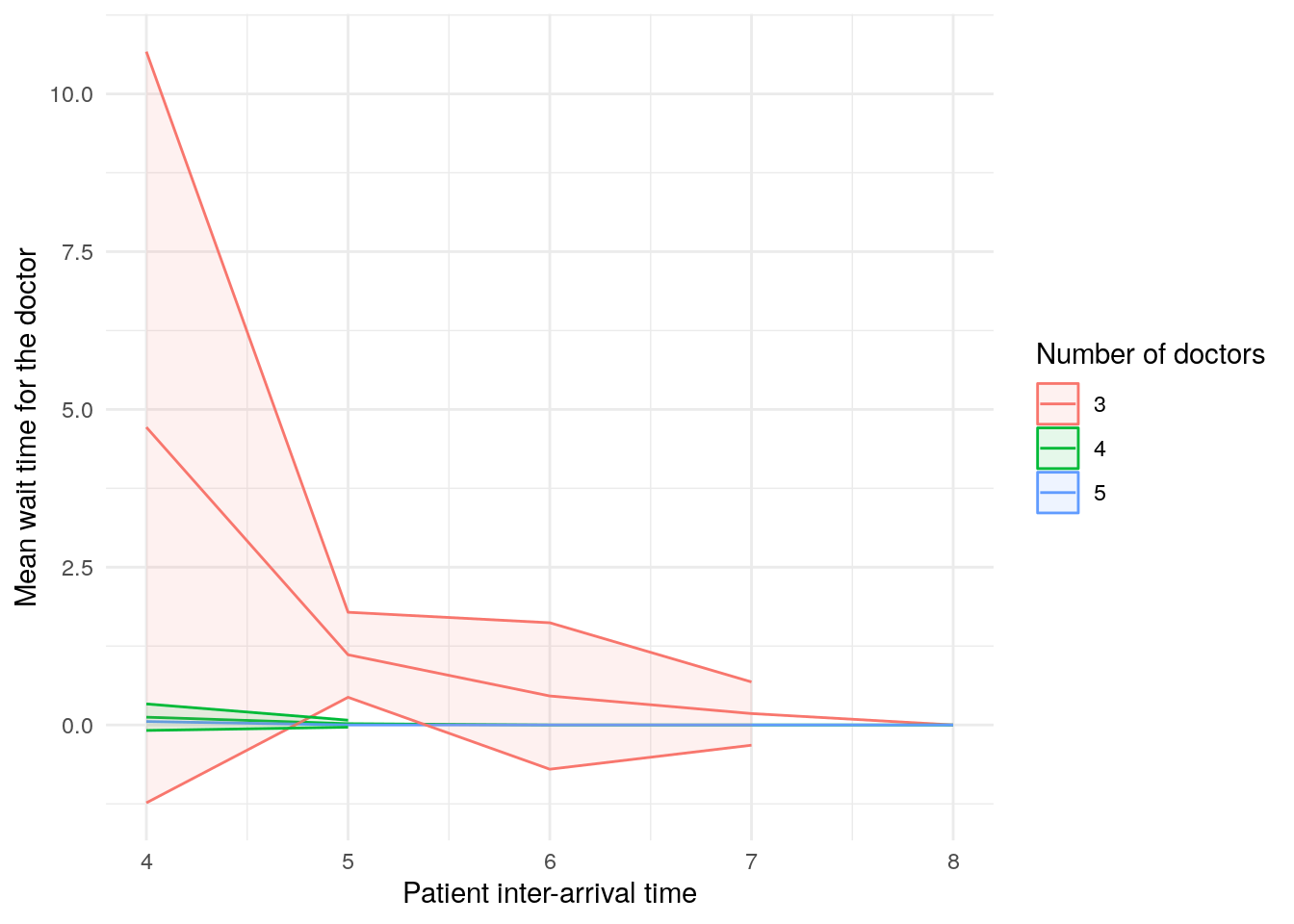
scenario_plots[["utilisation_doctor"]]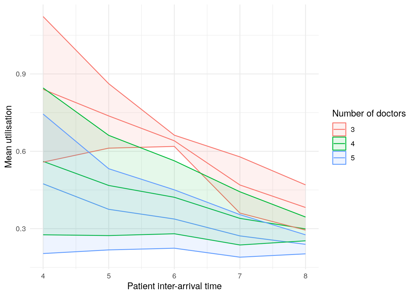
scenario_plots[["mean_queue_length_doctor"]]Warning: Removed 10 rows containing missing values or values outside the scale range
(`geom_ribbon()`).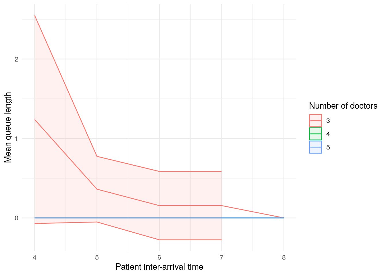
scenario_plots[["mean_time_in_system"]]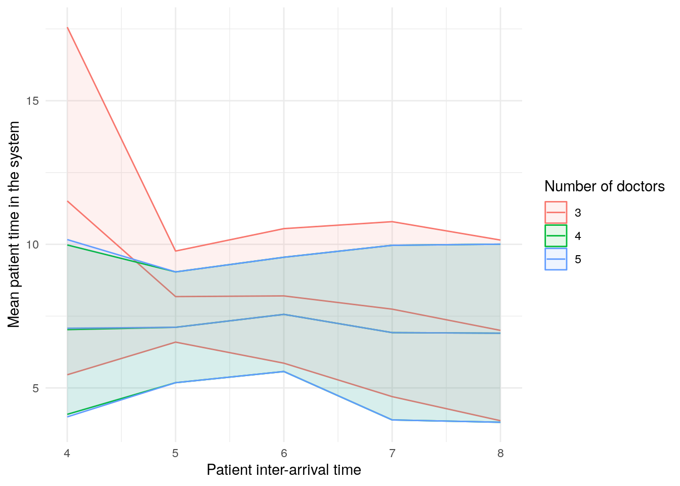
scenario_plots[["mean_patients_in_system"]]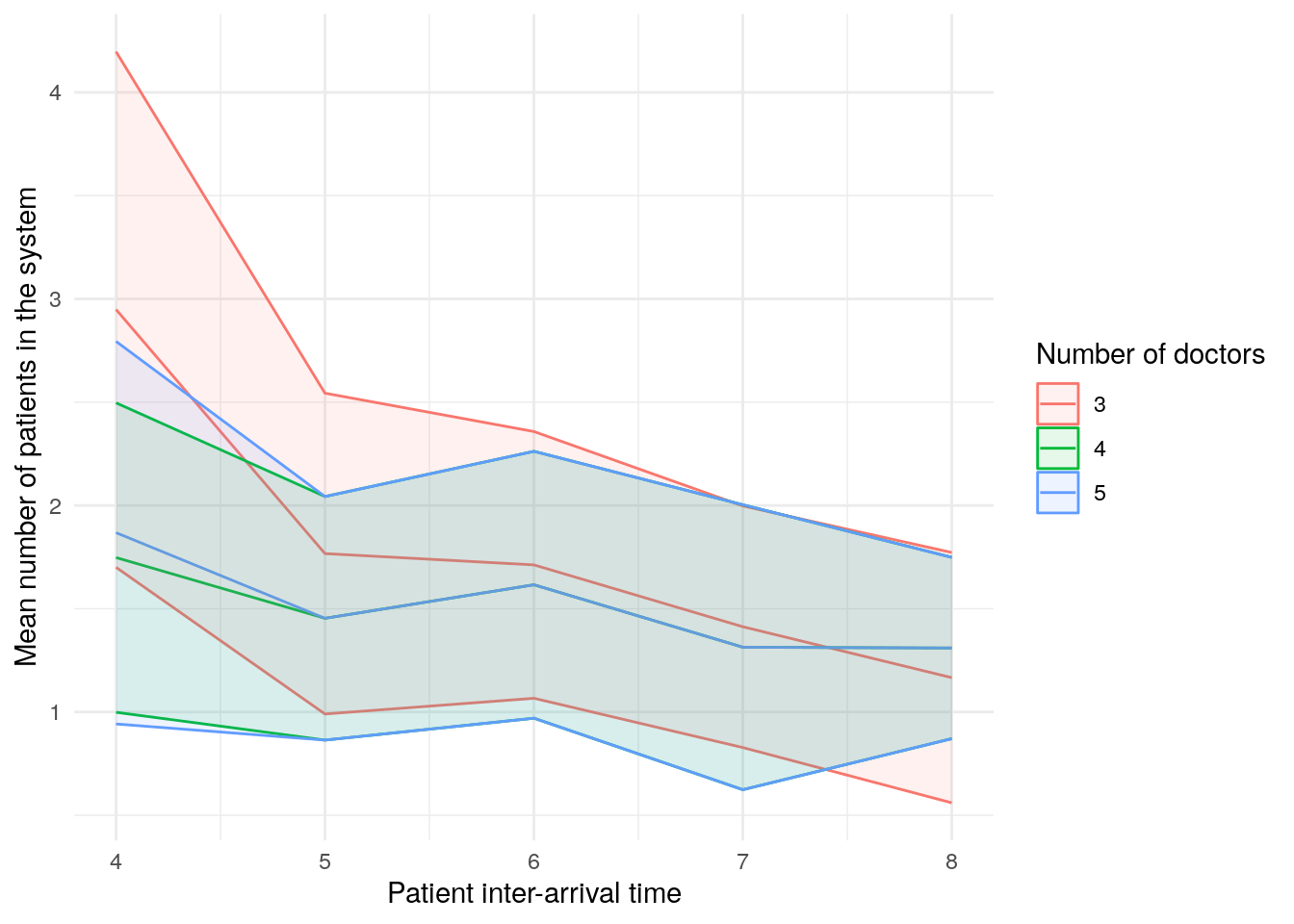
These plots look a little funny simple due to the wide confidence intervals - with very short run times and few replications in our illustrative example, the confidence intervals are very wide!
Sensitivity analysis
sensitivity_plots <- plot_metrics(
  summary_tables = sensitivity_tables,
  x_var = "interarrival_time",
  name_mappings = name_mappings,
  path_prefix = file.path("tables_figures_resources", "r_sensitivity")
)sensitivity_plots[["mean_wait_time_doctor"]]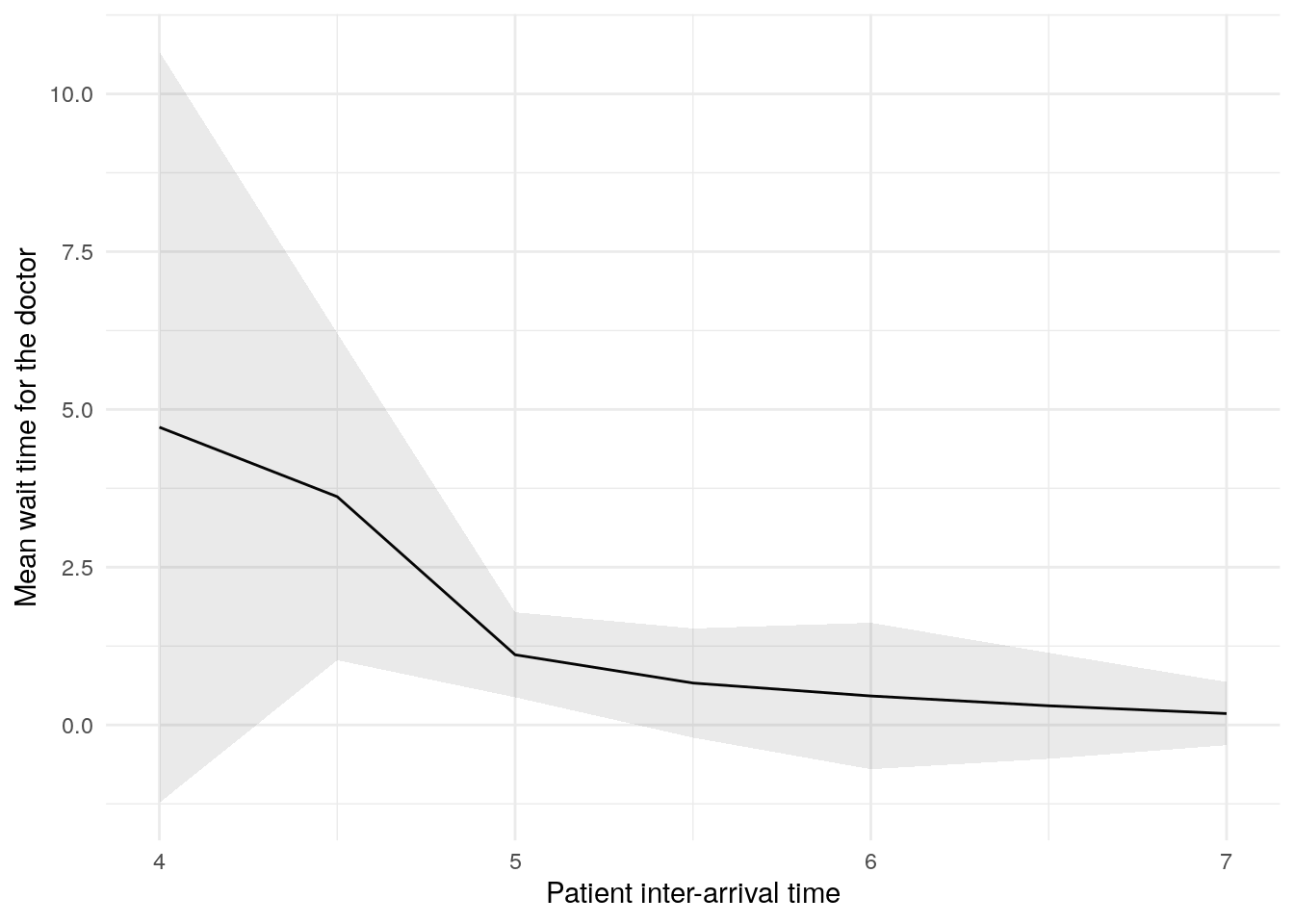
sensitivity_plots[["utilisation_doctor"]]
sensitivity_plots[["mean_queue_length_doctor"]]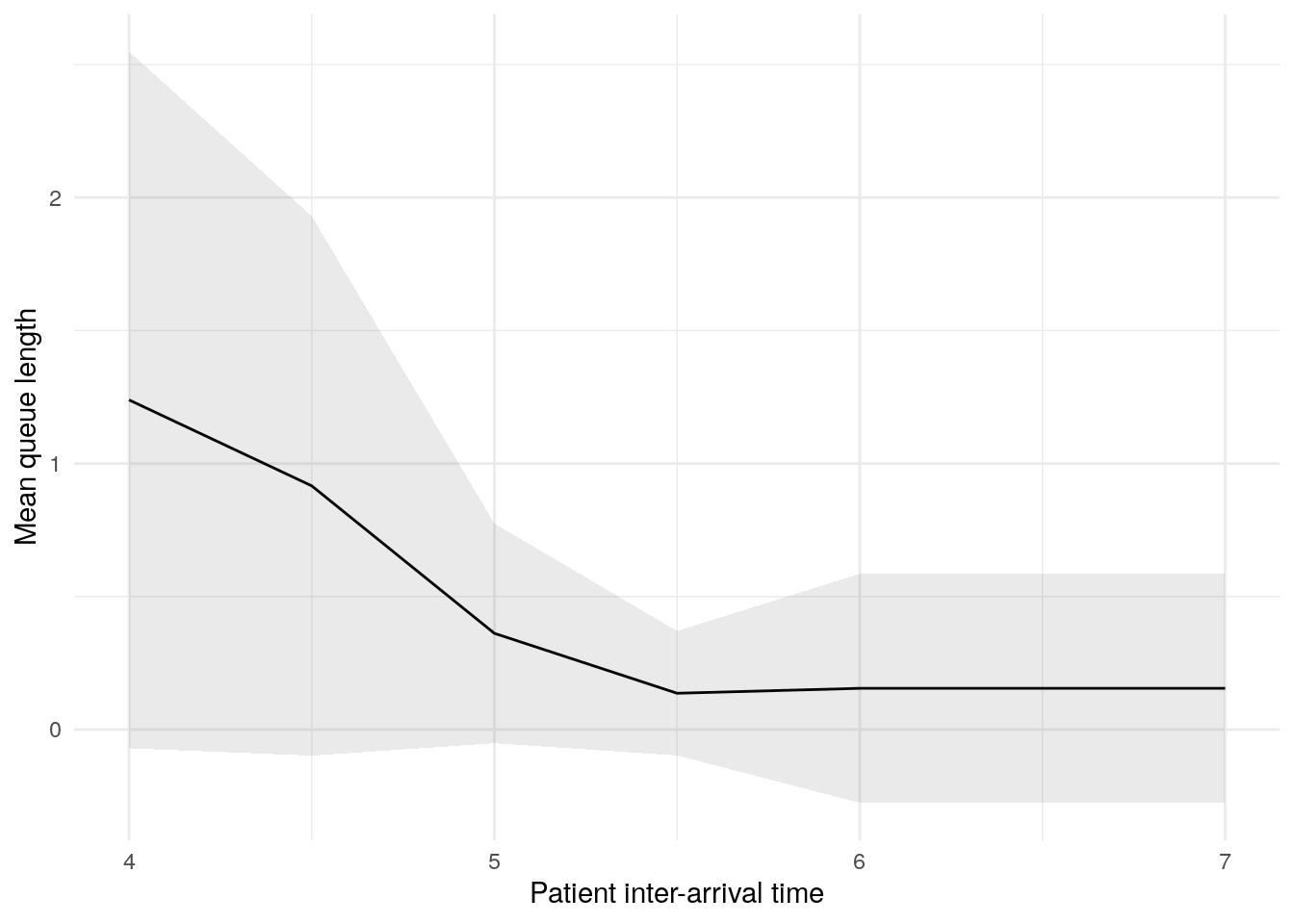
sensitivity_plots[["mean_time_in_system"]]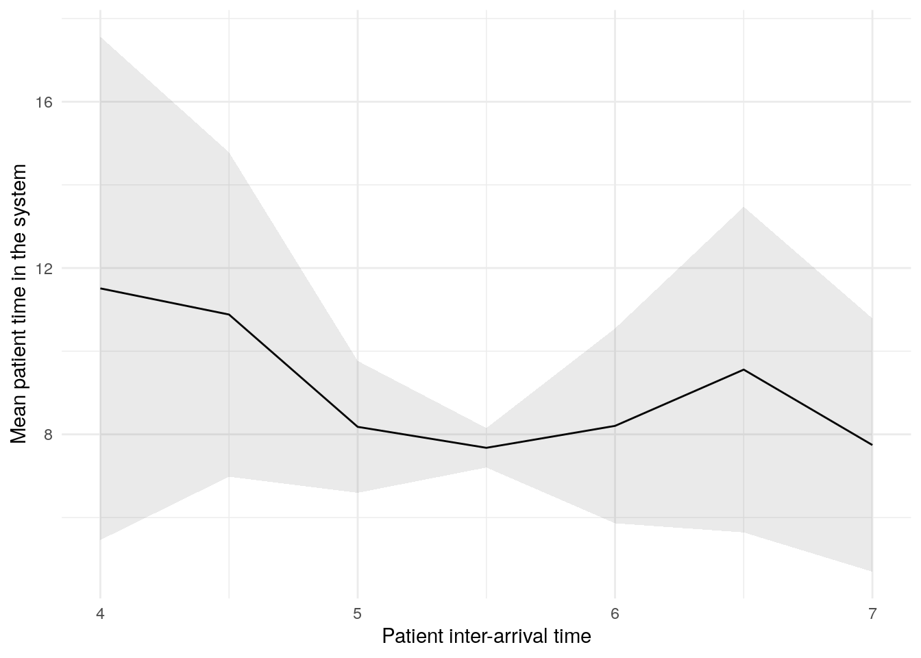
sensitivity_plots[["mean_patients_in_system"]]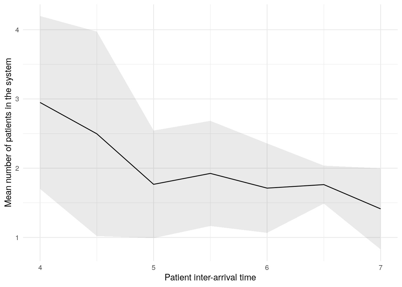
Explore the example models
Nurse visit simulation
![]() Click to visit pydesrap_mms repository
Click to visit pydesrap_mms repository
| Key files | notebooks/analysis.ipynb |
![]() Click to visit rdesrap_mms repository
Click to visit rdesrap_mms repository
| Key files | rmarkdown/analysis.md |
Stroke pathway simulation
![]() Click to visit pydesrap_stroke repository
Click to visit pydesrap_stroke repository
| Key files | notebooks/analysis.ipynb |
![]() Click to visit rdesrap_stroke repository
Click to visit rdesrap_stroke repository
| Key files | rmarkdown/analysis.md |
Test yourself
Create at least one table and figure from your simulation results.
If you don’t have any to hand, feel free to download ours:
Make sure to write and save code that generates your outputs, and that you save the outputs to files (e.g., csv for tables, png for figures).
For example, create a Jupyter notebook for the analysis, and then push that to your GitHub repository.
For example, create an Rmarkdown file for the analysis, and then push that to your GitHub repository.
References
Heather, Amy, Thomas Monks, Alison Harper, Navonil Mustafee, and Andrew Mayne. 2025. “On the Reproducibility of Discrete-Event Simulation Studies in Health Research: An Empirical Study Using Open Models.” Journal of Simulation 0 (0): 1–25. https://doi.org/10.1080/17477778.2025.2552177.