from distfit import distfit
import numpy as np
import pandas as pd
import plotly.express as px
import plotly.graph_objects as go
from scipy import statsInput modelling
Learning objectives:
- Identify what data is needed for input modelling and why quality matters.
- Understand how input data forms the basis for randomness in simulated systems.
- Inspect, fit, and select probability distributions for your model using both targeted and comprehensive approaches.
Acknowledgements: Inspired by Robinson (2007) and Monks (2024).
Required packages:
This should be available from environment setup in the “Test yourself” section of Environments.
library(dplyr)
library(fitdistrplus)
library(ggplot2)
library(lubridate)
library(plotly)
library(readr)
library(tidyr)Data
To build a DES model, you first need data that reflects the system you want to model. In healthcare, this might mean you need to access healthcare records with patient arrival, service and departure times, for example. The quality of your simulation depends directly on the quality of your data. Key considerations include:
- Accuracy. Inaccurate data leads to inaccurate simulation results.
- Sample size. Small samples can give misleading results if they capture unusual periods, lack variability, or are affected by outliers.
- Level of detail. The data must be granular enough for your needs. For example, daily totals may be insufficient if you want to model hourly arrivals (although may still be possible if know distribution - as noted below).
- Representative. The data should reflect the current system. For instance, data from the COVID-19 period may not represent typical operations.
Input data validation (covered on the verification and validation page) involves checking that the data (and distributions used) are appropriate and accurate reflections of your system.
How is this data used in the model?
Discrete-event simulation (DES) models are stochastic, which means they incorporate random variation, to reflect the inherent variability of real-world systems.
Instead of using fixed times for events (like having a patient arrive exactly every five minutes), DES models pick the timing of events by randomly sampling values from a probability distribution.
Input modelling
The process of selecting the most appropriate statistical distributions to use in your model is called input modelling.
When selecting appropriate distributions, if you only have summary statistics (like the mean), you may need to rely on expert opinion or the general properties of the process you’re modelling. For example:
- Arrivals: Random independent arrivals are often modelled with the Poisson distribution, whilst their inter-arrival times are modelled using an exponential distribution (Pishro-Nik (2014)).
- Length of stay: Length of stay is commonly right skewed (Lee, Fung, and Fu (2003)), and so will often be modelled with distributions like exponential, gamma, log-normal (for log-transformed length of stay) or Weibull.
However, these standard choices may not always be appropriate. If the actual process differs from your assumptions or has unique features, the chosen distribution might not fit well.
Therefore, if you have enough data, it’s best to analyse it directly to select the most suitable distributions. This analysis generally involves two key steps:
- Identify possible distributions. This is based on knowledge of the process being modelled, and by inspecting the data using time series plots and histograms.
- Fit distributions to your data and compare goodness-of fit. You can do this using a:
- Targeted approach. Just test the distributions from step 1.
- Comprehensive approach. Test a wide range of distributions.
Though the comprehensive approach tests lots of different distributions, it’s still important to do step 1 as:
- It’s important to be aware of temporal patterns in the data (e.g. spikes in service length every Friday).
- You may find distributions which mathematically fit but are contextually inappropriate (e.g. normal distribution for service times, which can’t be negative).
- You may find better fit for complex distributions, even when simpler are sufficient.
We’ll demonstrate steps for input modelling below using the synthetic arrival data from the nurse visit simulation (not based on real-world data). In this case, we already know which distributions to use (as we sampled from them to create our synthetic data!). However, the steps still illustrate how you might select distributions in practice with real data.
Set-up
Click here to download the arrival data.
You can also download a copy of the data dictionary:
We’ll run the analysis in a Jupyter Notebook. To create a notebook from the command line, run:
touch notebooks/input_modelling.ipynbWe’ll run the analysis in a R Markdown file. To create a file from the command line, run:
touch rmarkdown/input_modelling.RmdStep 1. Identify possible distributions
You first need to select which distributions to fit to your data. You should both:
- Consider the known properties of the process being modelled (as above), and-
- Inspect the data by plotting a histogram.
Regarding the known properties, it would be good to consider the exponential distribution for our arrivals, as that is a common choice for random independent arrivals.
To inspect the data, we will create two plots:
| Plot type | What does it show? | Why do we create this plot? |
|---|---|---|
| Time series | Trends, seasonality, and outliers (e.g., spikes or dips over time). | To check for stationarity (i.e. no trends or sudden changes). Stationary is an assumption of many distributions, and if trends or anomalies do exist, we may need to exclude certain periods or model them separately. The time series can also be useful for spotting outliers and data gaps. |
| Histogram | The shape of the data’s distribution. | Helps identify which distributions might fit the data. |
We repeat this for the arrivals and service (nurse consultation) time, so have created functions to avoid duplicate code between each.
First, we import the data. Specifying dtype ensures the time columns are read as strings so the original formatting and any leading zeros are preserved (instead of being lost if read as numbers).
# Import data
data = pd.read_csv("input_modelling_resources/NHS_synthetic.csv", dtype={
"ARRIVAL_TIME": str,
"SERVICE_TIME": str,
"DEPARTURE_TIME": str
})
# Preview data
data.head() ARRIVAL_DATE ARRIVAL_TIME ... DEPARTURE_DATE DEPARTURE_TIME
0 2025-01-01 0001 ... 2025-01-01 0012
1 2025-01-01 0002 ... 2025-01-01 0007
2 2025-01-01 0003 ... 2025-01-01 0030
3 2025-01-01 0007 ... 2025-01-01 0022
4 2025-01-01 0010 ... 2025-01-01 0031
[5 rows x 6 columns]First, we import the data.
# Import data, treating time columns as strings to preserve formatting
data <- read_csv(
file.path("input_modelling_resources", "NHS_synthetic.csv"),
show_col_types = FALSE
)
# Show the first few rows of the imported data
head(data)# A tibble: 6 × 6
ARRIVAL_DATE ARRIVAL_TIME SERVICE_DATE SERVICE_TIME DEPARTURE_DATE
<date> <chr> <date> <chr> <date>
1 2025-01-01 0001 2025-01-01 0007 2025-01-01
2 2025-01-01 0002 2025-01-01 0004 2025-01-01
3 2025-01-01 0003 2025-01-01 0010 2025-01-01
4 2025-01-01 0007 2025-01-01 0014 2025-01-01
5 2025-01-01 0010 2025-01-01 0012 2025-01-01
6 2025-01-01 0010 2025-01-01 0011 2025-01-01
# ℹ 1 more variable: DEPARTURE_TIME <chr>We then calculate the inter-arrival times (IAT). IAT means the amount of time between one arrival and the next.
# Combine ARRIVAL_DATE and ARRIVAL_TIME into a single datetime column so pandas
# can interpret it as a timestamp
data["arrival_datetime"] = pd.to_datetime(
data["ARRIVAL_DATE"] + " " + data["ARRIVAL_TIME"].str.zfill(4),
format="%Y-%m-%d %H%M"
)
# Sort records by arrival time before calculating time gaps between arrivals
# The diff() function gets the difference between each arrival and the previous
# .dt.total_seconds() gets the result in seconds, then divide by 60 for mins
data = data.sort_values("arrival_datetime")
data["iat_mins"] = (
data["arrival_datetime"].diff().dt.total_seconds() / 60
)
# Show the first few rows of the imported data
data[["ARRIVAL_DATE", "ARRIVAL_TIME", "arrival_datetime", "iat_mins"]].head() ARRIVAL_DATE ARRIVAL_TIME arrival_datetime iat_mins
0 2025-01-01 0001 2025-01-01 00:01:00 NaN
1 2025-01-01 0002 2025-01-01 00:02:00 1.0
2 2025-01-01 0003 2025-01-01 00:03:00 1.0
3 2025-01-01 0007 2025-01-01 00:07:00 4.0
4 2025-01-01 0010 2025-01-01 00:10:00 3.0data <- data %>%
# Combine date/time and convert to datetime
mutate(arrival_datetime = ymd_hm(paste(ARRIVAL_DATE, ARRIVAL_TIME))) %>%
# Sort by arrival time
arrange(arrival_datetime) %>%
# Calculate inter-arrival times
mutate(
iat_mins = as.numeric(
difftime(
arrival_datetime, lag(arrival_datetime), units = "mins"
)
)
)
# Preview
data %>%
select(ARRIVAL_DATE, ARRIVAL_TIME, arrival_datetime, iat_mins) %>%
head()# A tibble: 6 × 4
ARRIVAL_DATE ARRIVAL_TIME arrival_datetime iat_mins
<date> <chr> <dttm> <dbl>
1 2025-01-01 0001 2025-01-01 00:01:00 NA
2 2025-01-01 0002 2025-01-01 00:02:00 1
3 2025-01-01 0003 2025-01-01 00:03:00 1
4 2025-01-01 0007 2025-01-01 00:07:00 4
5 2025-01-01 0010 2025-01-01 00:10:00 3
6 2025-01-01 0010 2025-01-01 00:10:00 0We also calculate the service times.
# Combine service and departure dates/times into datetime columns
data["service_datetime"] = pd.to_datetime(
data["SERVICE_DATE"] + " " + data["SERVICE_TIME"].str.zfill(4)
)
data["departure_datetime"] = pd.to_datetime(
data["DEPARTURE_DATE"] + " " + data["DEPARTURE_TIME"].str.zfill(4)
)
# Calculate service time in minutes
# Subtracting two datetime columns gives a Timedelta object
# Dividing by pd.Timedelta(minutes=1) converts any duration into minutes
time_delta = data["departure_datetime"] - data["service_datetime"]
data["service_mins"] = time_delta / pd.Timedelta(minutes=1)
# Preview
data[["service_datetime", "departure_datetime", "service_mins"]].head() service_datetime departure_datetime service_mins
0 2025-01-01 00:07:00 2025-01-01 00:12:00 5.0
1 2025-01-01 00:04:00 2025-01-01 00:07:00 3.0
2 2025-01-01 00:10:00 2025-01-01 00:30:00 20.0
3 2025-01-01 00:14:00 2025-01-01 00:22:00 8.0
4 2025-01-01 00:12:00 2025-01-01 00:31:00 19.0data <- data %>%
mutate(
service_datetime = ymd_hm(paste(SERVICE_DATE, SERVICE_TIME)),
departure_datetime = ymd_hm(paste(DEPARTURE_DATE, DEPARTURE_TIME)),
service_mins = as.numeric(
difftime(departure_datetime, service_datetime, units = "mins")
)
)
# Preview
data %>% select(service_datetime, departure_datetime, service_mins) %>% head()# A tibble: 6 × 3
service_datetime departure_datetime service_mins
<dttm> <dttm> <dbl>
1 2025-01-01 00:07:00 2025-01-01 00:12:00 5
2 2025-01-01 00:04:00 2025-01-01 00:07:00 3
3 2025-01-01 00:10:00 2025-01-01 00:30:00 20
4 2025-01-01 00:14:00 2025-01-01 00:22:00 8
5 2025-01-01 00:12:00 2025-01-01 00:31:00 19
6 2025-01-01 00:11:00 2025-01-01 00:14:00 3Time series. For this data, we observe no trends, seasonality or outliers.
def inspect_time_series(time_series, y_lab):
"""
Plot time-series.
Parameters
----------
time_series : pd.Series
Series containing the time series data (where index is the date).
y_lab : str
Y axis label.
Returns
-------
fig : plotly.graph_objects.Figure
"""
# Label as "Date" and provided y_lab, and convert to dataframe
df = time_series.rename_axis("Date").reset_index(name=y_lab)
# Create plot
fig = px.line(df, x="Date", y=y_lab)
fig.update_layout(showlegend=False, width=700, height=400)
return fig# Calculate mean arrivals per day and plot time series
p = inspect_time_series(
time_series=data.groupby(by=["ARRIVAL_DATE"]).size(),
y_lab="Number of arrivals")
p.show()# Calculate mean service length per day, dropping last day (incomplete)
daily_service = data.groupby("SERVICE_DATE")["service_mins"].mean()
daily_service = daily_service.iloc[:-1]
# Plot mean service length each day
p = inspect_time_series(time_series=daily_service,
y_lab="Mean consultation length (min)")
p.show()#' Plot time-series
#'
#' @param time_series Dataframe with date column and numeric column to plot.
#' @param date_col String. Name of column with dates.
#' @param value_col String. Name of column with numeric values.
#' @param y_lab String. Y axis label.
#' @param interactive Boolean. Whether to render interactive or static plot.
#' @param save_path String. Path to save static file to (inc. name and
#' filetype). If NULL, then will not save.
#'
#' @importFrom ggplot2 aes geom_line ggplot ggsave labs theme_minimal
#' @importFrom plotly ggplotly
#' @importFrom rlang .data
#'
#' @return A ggplot object (static) or a plotly object (interactive type),
#' depending on `interactive` parameter.
#' @export
inspect_time_series <- function(
time_series, date_col, value_col, y_lab, interactive, save_path = NULL
) {
# Create custom tooltip text
time_series$tooltip_text <- paste0(
"<span style='color:white'>",
"Date: ", time_series[[date_col]], "<br>",
y_lab, ": ", time_series[[value_col]], "</span>"
)
# Create plot
p <- ggplot(time_series, aes(x = .data[[date_col]],
y = .data[[value_col]],
text = tooltip_text)) + # nolint: object_usage_linter
geom_line(group = 1L, color = "#727af4") +
labs(x = "Date", y = y_lab) +
theme_minimal()
# Save file if path provided
if (!is.null(save_path)) {
ggsave(save_path, p, width = 7L, height = 4L)
}
# Display as interactive or static figure
if (interactive) {
ggplotly(p, tooltip = "text", width = 700L, height = 400L)
} else {
p
}
}# Plot daily arrivals
daily_arrivals <- data %>% group_by(ARRIVAL_DATE) %>% count()
inspect_time_series(
time_series = daily_arrivals, date_col = "ARRIVAL_DATE", value_col = "n",
y_lab = "Number of arrivals", interactive = TRUE
)# Calculate mean service length per day, dropping last day (incomplete)
daily_service <- data %>%
group_by(SERVICE_DATE) %>%
summarise(mean_service = mean(service_mins)) %>%
filter(row_number() <= n() - 1L)
# Plot mean service length each day
inspect_time_series(
time_series = daily_service, date_col = "SERVICE_DATE",
value_col = "mean_service", y_lab = "Mean consultation length (min)",
interactive = TRUE
)Histogram. For both inter-arrival times and service times, we observe a right skewed distribution. Hence, it would be good to try exponential, gamma and Weibull distributions.
def inspect_histogram(series, x_lab, bin_width=1):
"""
Plot histogram.
Parameters
----------
series : pd.Series
Series containing the values to plot as a histogram.
x_lab : str
X axis label.
bin_width : int
Width of histogram X axis bins.
Returns
-------
fig : plotly.graph_objects.Figure
"""
# Calculate bin edges
min_val = int(series.min())
max_val = int(series.max()) + 1
bin_edges = np.arange(min_val, max_val + bin_width, bin_width)
nbins = len(bin_edges) - 1
# Plot histogram
fig = px.histogram(series, nbins=nbins)
fig.update_layout(
xaxis_title=x_lab, showlegend=False, width=700, height=400
)
# Build interval labels for each bin
bin_labels = [f"{x_lab}: {bin_edges[i]}–{bin_edges[i+1]}"
for i in range(nbins)]
fig.update_traces(
hovertemplate="%{customdata}<br>Count: %{y}",
customdata=bin_labels,
name=""
)
return fig# Plot histogram of inter-arrival times
p = inspect_histogram(series=data["iat_mins"],
x_lab="Inter-arrival time (min)")
p.show()# Plot histogram of service times
p = inspect_histogram(series=data["service_mins"],
x_lab="Consultation length (min)")
p.show()#' Plot histogram
#'
#' @param data A dataframe or tibble containing the variable to plot.
#' @param var String. Name of the column to plot as a histogram.
#' @param x_lab String. X axis label.
#' @param interactive Boolean. Whether to render interactive or static plot.
#' @param save_path String. Path to save static file to (inc. name and
#' filetype). If NULL, then will not save.
#'
#' @importFrom ggplot2 aes geom_histogram ggplot ggsave labs theme theme_minimal
#' @importFrom plotly ggplotly
#' @importFrom rlang .data
#'
#' @return A ggplot object (static) or a plotly object (interactive type),
#' depending on `interactive` parameter.
#' @export
inspect_histogram <- function(
data, var, x_lab, interactive, save_path = NULL
) {
# Remove non-finite values
data <- data[is.finite(data[[var]]), ]
# Create plot
p <- ggplot(data, aes(x = .data[[var]])) +
geom_histogram(
aes(
text = paste0(
"<span style='color:white'>", x_lab, ": ",
round(after_stat(x), 2L), "<br>Count: ", # nolint: object_usage_linter
after_stat(.data[["count"]]), "</span>"
)
),
fill = "#727af4", bins = 30L
) +
labs(x = x_lab, y = "Count") +
theme_minimal() +
theme(legend.position = "none")
# Save file if path provided
if (!is.null(save_path)) {
ggsave(save_path, p, width = 7L, height = 4L)
}
# Display as interactive or static figure
if (interactive) {
ggplotly(p, tooltip = "text", width = 700L, height = 400L)
} else {
p
}
}# Plot histogram of inter-arrival times
inspect_histogram(
data = data, var = "iat_mins", x_lab = "Inter-arrival time (min)",
interactive = TRUE
)# Plot histogram of service times
inspect_histogram(
data = data, var = "service_mins", x_lab = "Consultation length (min)",
interactive = TRUE
)Alternative: You can use the fitdistrplus package to create these histograms - as well as the empirical cumulative distribution function (CDF), which can help you inspect the tails, central tendency, and spot jumps or plateaus in the data.
# Get IAT and service time columns as numeric vectors (with NA dropped)
data_iat <- data %>% drop_na(iat_mins) %>% select(iat_mins) %>% pull()
data_service <- data %>% select(service_mins) %>% pull()
# Plot histograms and CDFs
plotdist(data_iat, histo = TRUE, demp = TRUE)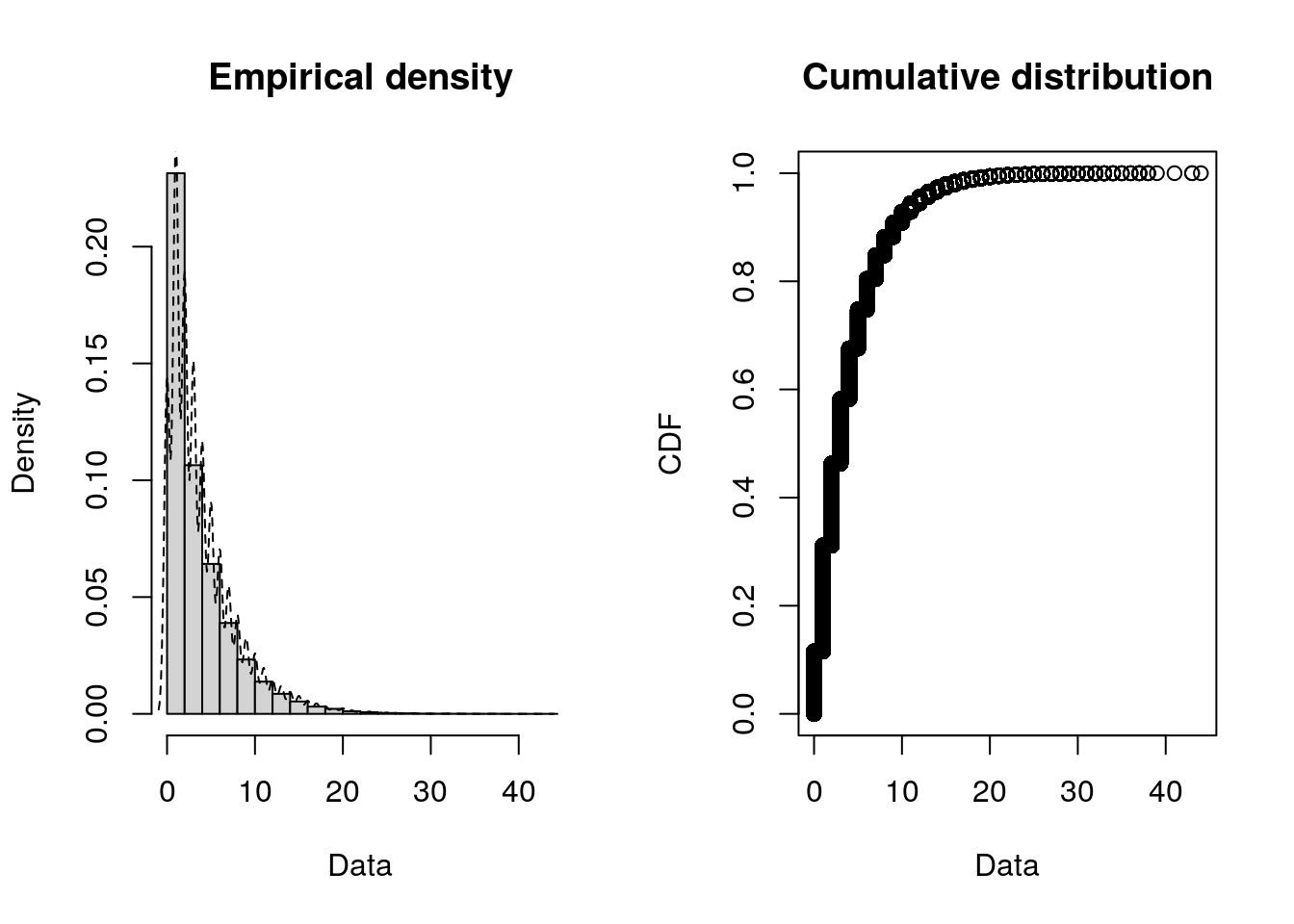
plotdist(data_service, histo = TRUE, demp = TRUE)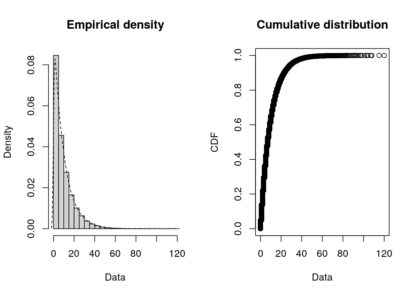
Step 2. Fit distributions and compare goodness-of fit
We will fit distributions and assess goodness-of-fit using the Kolmogorov-Smirnov (KS) Test. This is a common test which is well-suited to continuous distributions. For categorical (or binned) data, consider using chi-squared tests.
The KS Test returns a statistic and p value.
- Statistic: Measures how well the distribution fits your data.
- Lower KS test statistics indicate a better fit.
- Ranges from 0 to 1.
- P-value: Tells you if the fit could have happened by chance.
- Higher p-values suggest the data follow the distribution.
- In large datasets, even good fits often have small p-values.
- Ranges from 0 to 1.
scipy.stats is a popular library for fitting and testing statistical distributions. For more convenience, distfit, which is built on scipy, is another popular package which can test multiple distributions simultaneously (or evaluate specific distributions).
We will illustrate how to perform the targeted approach using scipy directly, and the comprehensive approach using distfit - but you could use either for each approach.
fitdistrplus is a popular library for fitting and testing statistical distributions. This can evaluate specific distributions or test multiple distributions. We will use this library to illustrate how to perform the targeted or comprehensive approach.
Targeted approach
To implement the targeted approach using scipy.stats…
def fit_distributions(input_series, dists):
"""
This function fits statistical distributions to the provided data and
performs Kolmogorov-Smirnov tests to assess the goodness of fit.
Parameters
----------
input_series : pandas.Series
The observed data to fit the distributions to.
dists : list
List of the distributions in scipy.stats to fit, eg. ["expon", "gamma"]
Notes
-----
A lower test statistic and higher p-value indicates better fit to the data.
"""
for dist_name in dists:
# Fit distribution to the data
dist = getattr(stats, dist_name)
params = dist.fit(input_series)
# Return results from Kolmogorov-Smirnov test
ks_result = stats.kstest(input_series, dist_name, args=params)
print(f"Kolmogorov-Smirnov statistic for {dist_name}: " +
f"{ks_result.statistic:.4f} (p={ks_result.pvalue:.5f})")
# Fit and run Kolmogorov-Smirnov test on the inter-arrival and service times
distributions = ["expon", "gamma", "weibull_min"]Inter-arrival time:
fit_distributions(input_series=data["iat_mins"].dropna(), dists=distributions)Kolmogorov-Smirnov statistic for expon: 0.1155 (p=0.00000)
Kolmogorov-Smirnov statistic for gamma: 0.2093 (p=0.00000)
Kolmogorov-Smirnov statistic for weibull_min: 0.1355 (p=0.00000)Service time:
fit_distributions(input_series=data["service_mins"], dists=distributions)Kolmogorov-Smirnov statistic for expon: 0.0480 (p=0.00000)
Kolmogorov-Smirnov statistic for gamma: 0.1226 (p=0.00000)
Kolmogorov-Smirnov statistic for weibull_min: 0.0696 (p=0.00000)We have several of zeros (as times are rounded to nearest minute, and arrivals are frequent / service times can be short). Weibull is only defined for positive values, so we won’t try that. We have built in error-handling to fit_distributions to ensure that.
# Percentage of inter-arrival times that are 0
paste0(round(sum(data_iat == 0L) / length(data_iat) * 100L, 2L), "%")[1] "11.55%"paste0(round(sum(data_service == 0L) / length(data_service) * 100L, 2L), "%")[1] "4.8%"#' Compute Kolmogorov-Smirnov Statistics for Fitted Distributions
#'
#' @param data Numeric vector. The data to fit distributions to.
#' @param dists Character vector. Names of distributions to fit.
#'
#' @return Named numeric vector of Kolmogorov-Smirnov statistics, one per
#' distribution.
#' @export
fit_distributions <- function(data, dists) {
# Define distribution requirements
positive_only <- c("lnorm", "weibull")
non_negative <- c("exp", "gamma")
zero_to_one <- "beta"
# Check data characteristics
has_negatives <- any(data < 0L)
has_zeros <- any(data == 0L)
has_out_of_beta_range <- any(data < 0L | data > 1L)
# Filter distributions based on data
valid_dists <- dists
if (has_negatives || has_zeros) {
valid_dists <- setdiff(valid_dists, positive_only)
}
if (has_negatives) {
valid_dists <- setdiff(valid_dists, non_negative)
}
if (has_out_of_beta_range) {
valid_dists <- setdiff(valid_dists, zero_to_one)
}
# Warn about skipped distributions
skipped <- setdiff(dists, valid_dists)
if (length(skipped) > 0L) {
warning("Skipped distributions due to data constraints: ",
toString(skipped), call. = FALSE)
}
# Exit early if no valid distributions remain
if (length(valid_dists) == 0L) {
warning("No valid distributions to test after filtering", call. = FALSE)
return(numeric(0L))
}
# Fit remaining distributions
fits <- lapply(
valid_dists, function(dist) suppressWarnings(fitdist(data, dist))
)
gof_results <- gofstat(fits, fitnames = valid_dists)
# Return KS statistics
gof_results$ks
}
distributions <- c("exp", "gamma", "weibull")
fit_distributions(data_iat, distributions)Warning: Skipped distributions due to data constraints: weibull exp gamma
0.1154607 0.1154607 fit_distributions(data_service, distributions)Warning: Skipped distributions due to data constraints: weibull exp gamma
0.04796992 0.04796992 Although both the KS test statistic and p-value are reported, it’s common for the p-value to round to zero, especially with large datasets. In these cases, differences in test statistic are more informative for comparing models than tiny differences in p-value.
Unsurprisingly, the best fit for both is the exponential distribution (as it has the lowest test statistic).
We can create a version of our histograms from before but with the distributions overlaid, to visually support this.
def inspect_histogram_with_fits(series, x_lab, dist_name):
"""
Plot histogram with overlaid fitted distributions.
Parameters
----------
series : pd.Series
Series containing the values to plot as a histogram.
x_lab : str
X axis label.
dist_name : str
Name of the distributions in scipy.stats to fit, eg. "expon"
Returns
-------
fig : plotly.graph_objects.Figure
"""
# Plot histogram with probability density normalisation
fig = px.histogram(series, nbins=30, histnorm="probability density")
fig.update_layout(
xaxis_title=x_lab, showlegend=True, width=700, height=400
)
# Fit and plot each distribution
x = np.linspace(series.min(), series.max(), 1000)
dist = getattr(stats, dist_name)
params = dist.fit(series.dropna())
pdf_fitted = dist.pdf(x, *params[:-2], loc=params[-2], scale=params[-1])
fig.add_trace(go.Scatter(x=x, y=pdf_fitted, mode="lines", name=dist_name))
return fig# Plot histograms with fitted distributions
p = inspect_histogram_with_fits(series=data["iat_mins"].dropna(),
x_lab="Inter-arrival time (min)",
dist_name="expon")
p.show()p = inspect_histogram_with_fits(series=data["service_mins"],
x_lab="Service time (min)",
dist_name="expon")
p.show()The simplest way to do this is to just use the plotting functions from fitdistrplus.
# Fit and create plot for IAT
iat_exp <- suppressWarnings(fitdist(data_iat, "exp"))
denscomp(iat_exp, legendtext = "Exponential")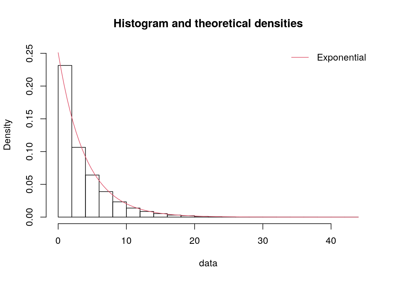
# Fit and create plot for service
ser_exp <- suppressWarnings(fitdist(data_service, "exp"))
denscomp(ser_exp, legendtext = "Exponential")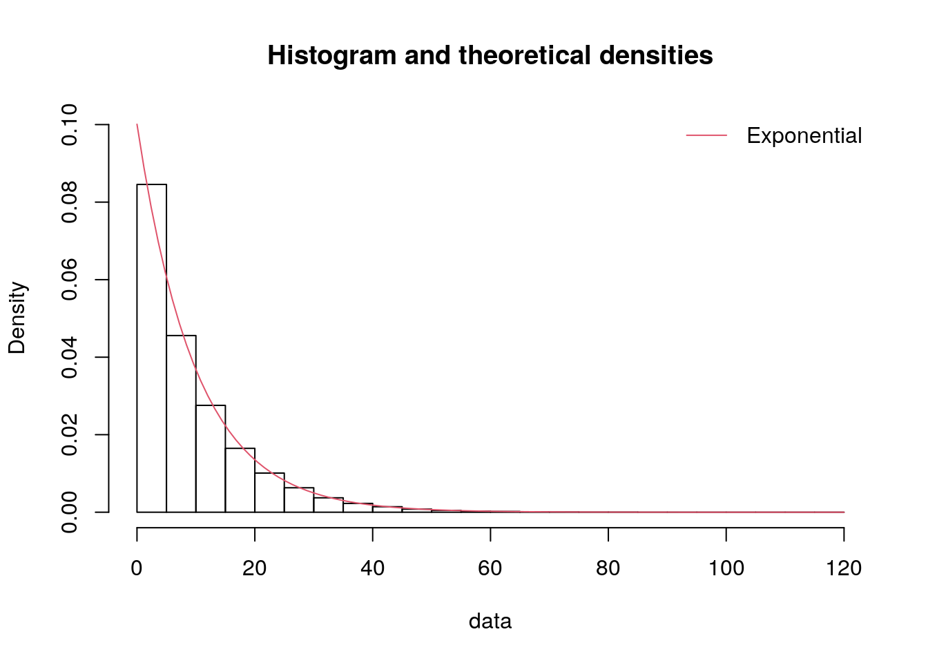
Comprehensive approach
To implement the comprehensive approach using distfit…
# Fit popular distributions to inter-arrivals times
dfit_iat = distfit(distr="popular", stats="RSS", verbose="silent")
_ = dfit_iat.fit_transform(data["iat_mins"].dropna())
# Fit popular distributions to service times
dfit_service = distfit(distr="popular", stats="RSS", verbose="silent")
_ = dfit_service.fit_transform(data["service_mins"])We can view a summary table from distfit using .summary.
The score column is the result from a goodness-of-fit test. This is set using stats in distfit (e.g. distfit(stats="RSS")). It provides several possible tests including:
RSS- residual sum of squareswasserstein- Wasserstein distanceks- Kolmogorov-Smirnov statisticenergy- energy distancegoodness_of_fit- general purpose test fromscipy.stats.goodness_of_fit
For continuous data, ks is often a good choice - but for distfit, they use an unusual method for calculation of this statistic. In distfit, they resample from the fitted distribution and compare that to the original data. Meanwhile, our targeted implementation just used the standard KS test from scipy.stats, which is the standard KS statistics that is commonly understood.
As such, we have left distfit with RSS.
print(dfit_iat.summary) name score loc ... bootstrap_score bootstrap_pass color
0 beta 2.236862 -0.0 ... 0 None #e41a1c
1 gamma 2.244529 -0.0 ... 0 None #e41a1c
2 expon 2.248399 0.0 ... 0 None #377eb8
3 pareto 2.248399 -16777216.0 ... 0 None #4daf4a
4 genextreme 2.291064 1.894057 ... 0 None #984ea3
5 t 2.362306 2.912024 ... 0 None #ff7f00
6 dweibull 2.382298 3.375977 ... 0 None #ffff33
7 norm 2.425599 3.984361 ... 0 None #a65628
8 loggamma 2.428989 -1704.139387 ... 0 None #f781bf
9 uniform 2.756889 0.0 ... 0 None #999999
10 lognorm 2.848256 -0.0 ... 0 None #999999
[11 rows x 10 columns]print(dfit_service.summary) name score loc ... bootstrap_score bootstrap_pass color
0 expon 0.139598 0.0 ... 0 None #e41a1c
1 pareto 0.139598 -134217728.0 ... 0 None #e41a1c
2 beta 0.143915 -0.0 ... 0 None #377eb8
3 genextreme 0.146462 4.637192 ... 0 None #4daf4a
4 gamma 0.15018 -0.0 ... 0 None #984ea3
5 t 0.164133 7.212988 ... 0 None #ff7f00
6 dweibull 0.165662 7.461138 ... 0 None #ffff33
7 norm 0.175165 9.99157 ... 0 None #a65628
8 loggamma 0.175957 -3410.960835 ... 0 None #f781bf
9 uniform 0.236151 0.0 ... 0 None #999999
10 lognorm 0.250472 -0.0 ... 0 None #999999
[11 rows x 10 columns]However, we can calculate a standard KS statistic ourselves using the function below - which, as we can see, matches up with our targeted approach results above.
def calculate_ks(input_series, dfit_summary):
"""
Calculate standard Kolmogorov-Smirnov statistics for fitted distributions.
This function applies the standard scipy.stats.kstest to data using the
distribution parameters obtained from distfit, providing conventional
KS statistics rather than distfit's resampling-based approach.
Parameters
----------
input_series : pandas.Series
The original data series used for distribution fitting.
dfit_summary : pandas.DataFrame
The summary DataFrame from a distfit object, containing fitted
distribution names and parameters.
Returns
-------
pandas.DataFrame
A DataFrame containing the distribution names, KS statistics,
and p-values from the standard KS test.
Notes
-----
Lower KS statistic values indicate better fits to the data.
"""
results = []
for _, row in dfit_summary.iterrows():
dist_name = row["name"]
dist_params = row["params"]
# Perform KS test using scipy.stats.kstest
ks_result = stats.kstest(input_series, dist_name, args=dist_params)
# Store the results
results.append({
"name": dist_name,
"ks": ks_result.statistic[0],
"p_value": ks_result.pvalue[0]
})
# Create a DataFrame with the results, rounded to 5 d.p.
return pd.DataFrame(results).sort_values(by="ks").round(5)calculate_ks(input_series=data[["iat_mins"]].dropna(),
dfit_summary=dfit_iat.summary) name ks p_value
4 genextreme 0.11538 0.0
3 pareto 0.11546 0.0
2 expon 0.11546 0.0
6 dweibull 0.15812 0.0
5 t 0.16005 0.0
8 loggamma 0.17797 0.0
7 norm 0.17965 0.0
0 beta 0.19992 0.0
1 gamma 0.20931 0.0
10 lognorm 0.52377 0.0
9 uniform 0.70367 0.0calculate_ks(input_series=data[["service_mins"]],
dfit_summary=dfit_service.summary) name ks p_value
1 pareto 0.04797 0.0
0 expon 0.04797 0.0
3 genextreme 0.07098 0.0
2 beta 0.09261 0.0
4 gamma 0.12257 0.0
7 norm 0.15810 0.0
5 t 0.16006 0.0
8 loggamma 0.16195 0.0
6 dweibull 0.17533 0.0
10 lognorm 0.53617 0.0
9 uniform 0.71336 0.0The distfit package has some nice visualisation functions. For example, using the inter-arrival times…
# PDF with all the distributions overlaid
p, _ = dfit_iat.plot(n_top=11, figsize=(7, 4))
p.show()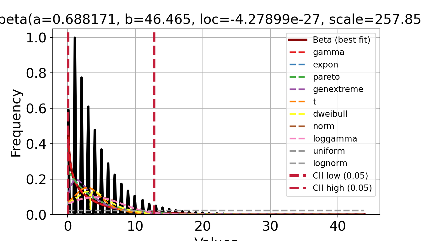
# CDF with all the distributions overlaid
p, _ = dfit_iat.plot(chart="cdf", n_top=11, figsize=(7, 4))
p.show()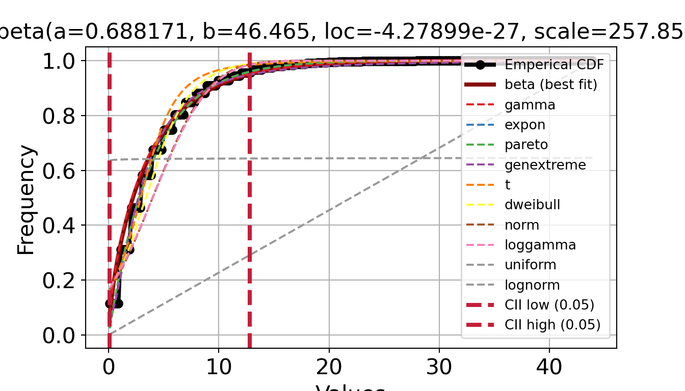
# QQ plot with all distributions overlaid
p, _ = dfit_iat.qqplot(data["iat_mins"].dropna(), n_top=11, figsize=(7, 4))
p.show()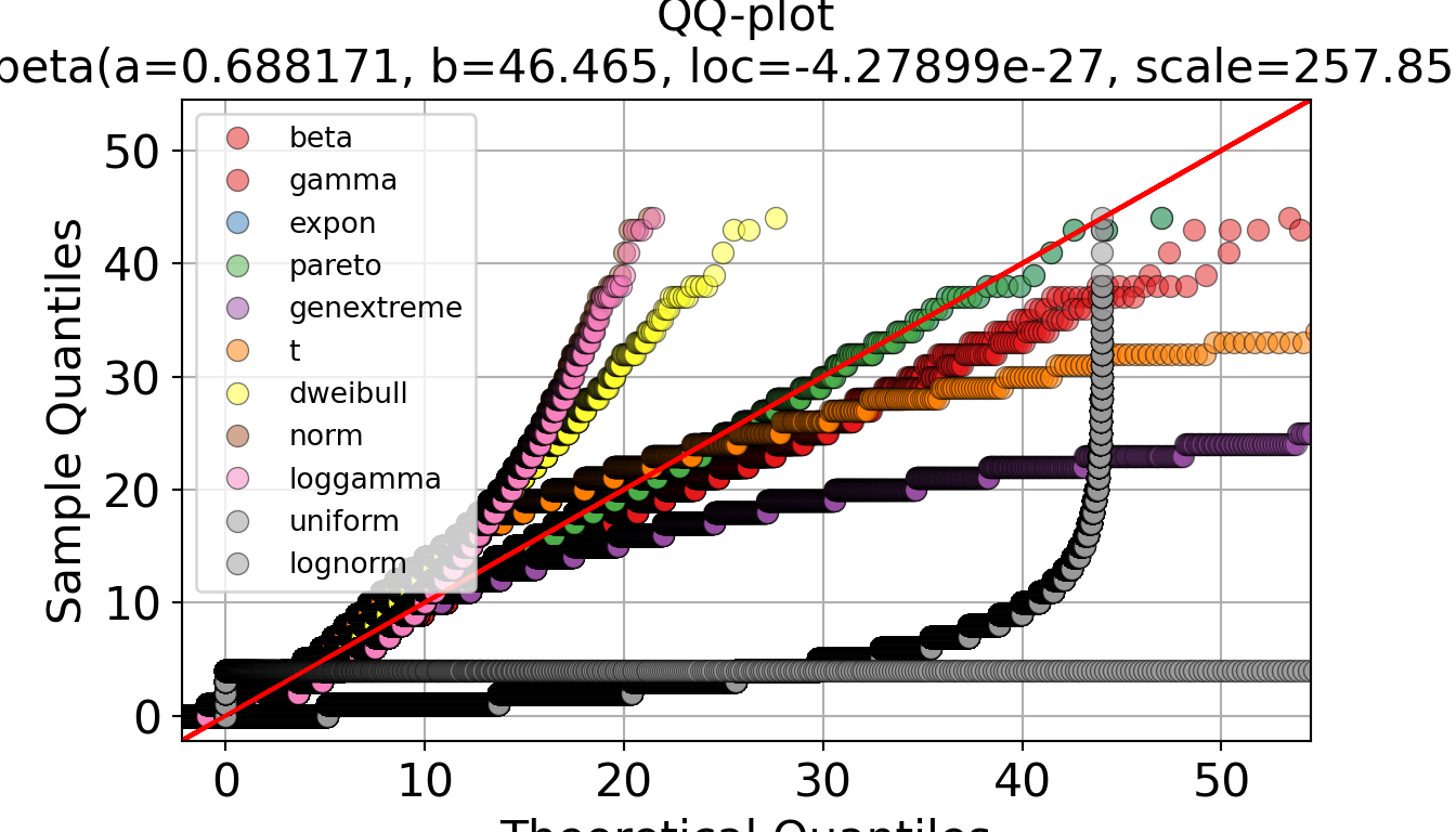
# Summary plot using the RSS
p, _ = dfit_iat.plot_summary(figsize=(7, 4))
p.show()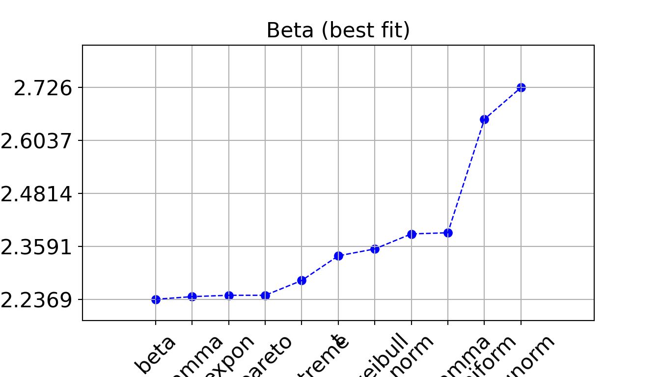
We can also use it to create a plot with a specific distribution overlaid, like in the targeted approach:
# To create a plot with a specific distribution overlaid...
dfit = distfit(distr="expon")
_ = dfit.fit_transform(data["iat_mins"].dropna())
p, _ = dfit.plot(figsize=(7, 4))
p.show()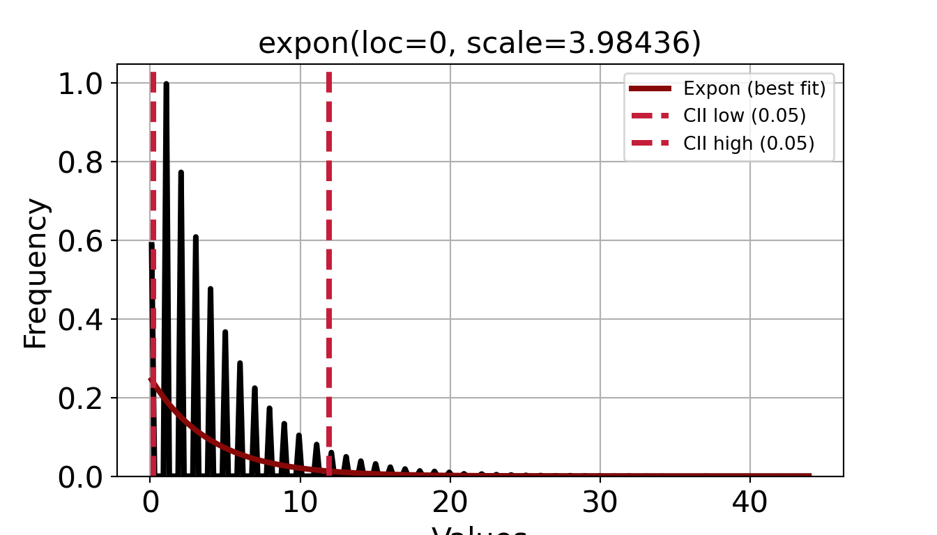
The fitdistrplus package does not have a built-in function to automatically fit a large set of distributions in a single command. Instead, we just need to specify a list of candidate distributions.
# Continuous distributions supported natively by fitdist
# (you could use other packages to get other distributions to test)
distributions <- c("norm", "lnorm", "exp", "cauchy", "gamma", "logis", "beta",
"weibull", "unif")
fit_distributions(data_iat, distributions)Warning: Skipped distributions due to data constraints: lnorm, beta, weibull norm exp cauchy gamma logis unif
0.1796464 0.1154607 0.1968200 0.1154607 0.1564321 0.7036682 fit_distributions(data_service, distributions)Warning: Skipped distributions due to data constraints: lnorm, beta, weibull norm exp cauchy gamma logis unif
0.15810466 0.04796992 0.19728636 0.04796992 0.15566197 0.71336153 Again, exponential is returned as the best fit.
Plots
The fitdistrplus package also has some nice visualisation functions.
iat_exp <- suppressWarnings(fitdist(data_iat, "exp"))
plot(iat_exp)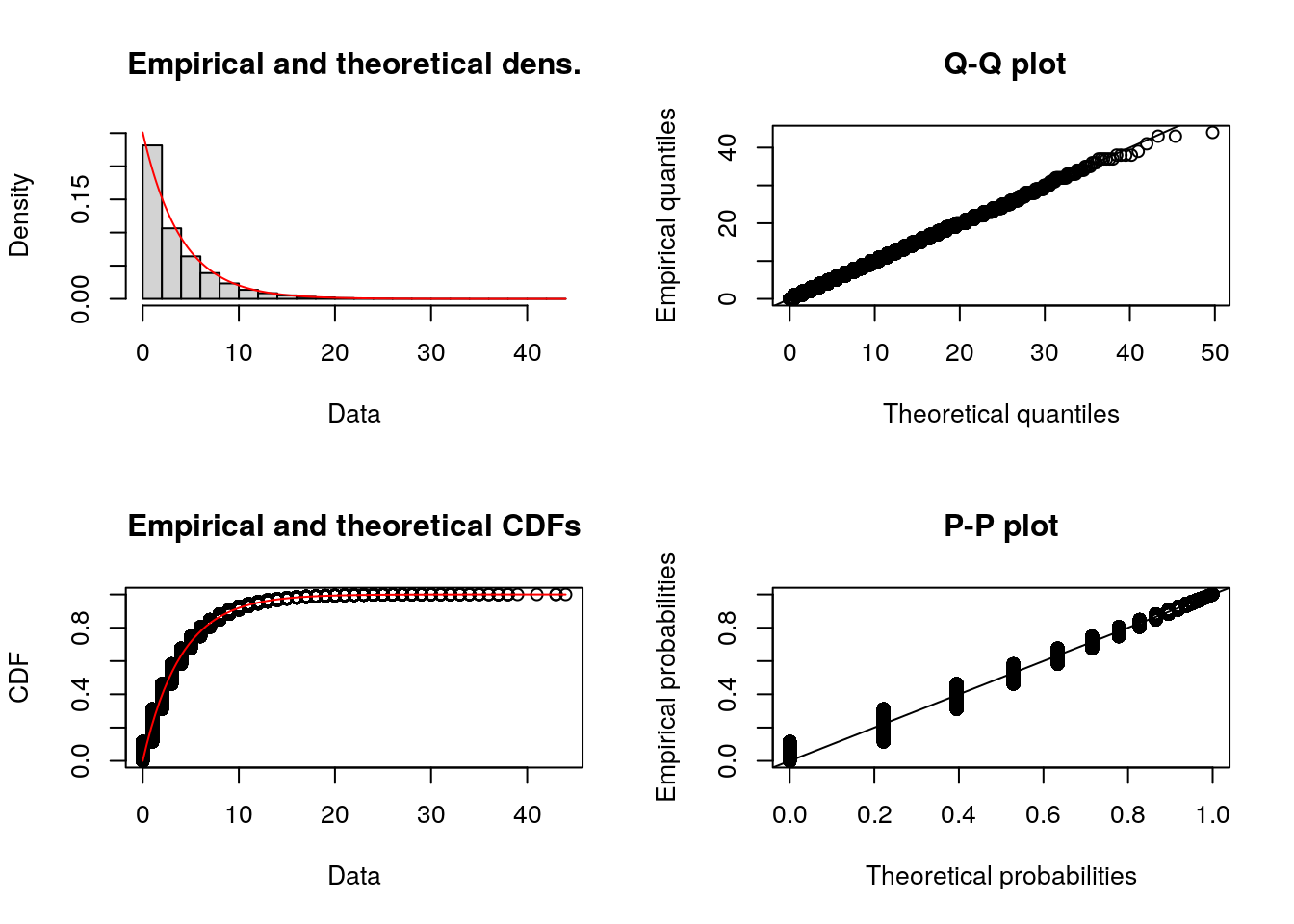
Step 3. Choose distributions
Using the targeted approach, we found exponential to be the best. Using the comprehensive approach, there were a few distributions that were all very low scores (pareto, expon, genextreme). Choosing between these…
- Exponential - simple, wide application, good for context, fewer parameters
- Generalised pareto - useful if data has heavier tail (not the case here)
- Generalised extreme value - more complex, spefically designed for modeling maximum values or extreme events
As such, exponential seems a good choice for inter-arrival and service times.
Using the targeted and comprehensive approach, we found exponential to be best for inter-arrival and service times.
Parameters
The exponential distribution is defined by a single parameter, but this parameter can be expressed in two ways - as the:
- Mean (also called the scale) - this is just your sample mean.
- Rate (also called lambda λ) - this is calculated as
1 / mean.
We will use the Exponential class from sim-tools, which uses the numpy.random.exponential() function. That accepts the scale parameter, so we just need to calculate the sample mean.
Mean:
- Inter-arrival time: 4 minutes.
- Service time: 10 minutes.
print(data["iat_mins"].dropna().mean())
print(data["service_mins"].dropna().mean())We will use the rexp() function from the stats package which requires the rate parameter, not the mean.
Rate:
- Inter-arrival time: 0.25
- Service time: 0.1
1L / mean(data_iat)[1] 0.25098131L / mean(data_service)[1] 0.1000844For guidance on storing and using these parameters, see the pages managing parameters in a script and in a file.
Test yourself
If you haven’t already followed along, now’s the time to put everything from this page into practice!
Task:
- Download the arrival data, and create a Jupyter notebook for your analysis.
- Download the arrival data, and create an R markdown file for your analysis.
- Inspect the arrival data and fit it to probability distributions. You can use
distfitor any of the other functions introduced above.
- Inspect the arrival data and fit it to probability distributions. You can use
fitdistrplusor any of the other functions introduced above.
References
Lee, Andy H., Wing K. Fung, and Bo Fu. 2003. “Analyzing Hospital Length of Stay: Mean or Median Regression?” Medical Care 41 (5): 681–86. https://doi.org/10.1097/01.MLR.0000062550.23101.6F.
Monks, Thomas. 2024. “Simulation Modelling for Stochastic Systems Lab 3.” https://github.com/health-data-science-OR/stochastic_systems/tree/master/labs/simulation/lab3.
Pishro-Nik, Hossein. 2014. “Basic Concepts of the Poisson Process.” https://www.probabilitycourse.com/chapter11/11_1_2_basic_concepts_of_the_poisson_process.php.
Robinson, Stewart. 2007. “Chapter 7: Data Collection and Analysis.” In Simulation: The Practice of Model Development and Use, 95–125. John Wiley & Sons.