Exercise 6. Customising the site appearance
On this page we will:
- Tweak the look and feel of your Quarto site.
- Connect settings in
_quarto.ymlwith CSS styles. - Experiment with colours, headings, and page width.
There are endless ways to customise how your Quarto site looks and behaves. This page introduces a few common options (like favicons, navigation, themes, and layout), but there is much more you can explore in the Quarto documentation, by looking at example sites, or by asking for help (including from AI tools) with small bits of HTML, CSS, or JavaScript. As you experiment, remember the goal here is not to write lots of code, but to make a few simple, readable tweaks that improve how your site feels for you and your readers.
1 Favicon
A favicon is the small icon that appears in the browser tab next to your site title.
For a Quarto website, you set this in _quarto.yml using the favicon option inside the website: section. For example:
website:
  title: "Site title"
  favicon: images/favicon.png
Favicons are usually square images (e.g., 16x16, 32x32, or 48x48 pixels), saved as PNG so transparent backgrounds are supported. They do not need to be large; browsers will scale them down to a tiny size for the tab icon.
Task:
3 Announcement
An announcement bar is a horizontal strip at the top of your site that shows an important message. It’s useful for things like:
- A status message (e.g., “This site is a work in progress”).
- A short disclaimer (e.g., a research project site that shows a note on every page about generalisability and how the results can be reused - example).
- Course or event information (e.g., a training course site that uses it to provide information on upcoming HSMA dates and registration details - example).
You can configure it in _quarto.yml under website: → announcement:. For example:
- 1
-
Content: The text shown in the bar. You can use simple Markdown for bold (
** **) or links ([]()). - 2
-
Dismissable: If
true, visitor will see a little “x” and can close the bar. Iffalse, it always stays visible. - 3
-
Position: Where the bar appears - e.g.,
below-navbar,above-navbar.
You can find more announcement options (such as icons and types like “info” or “warning”) in the Quarto documentation.
Task:
5 Themes
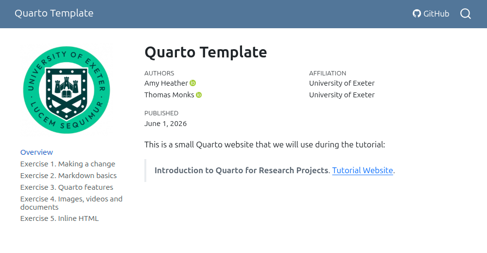
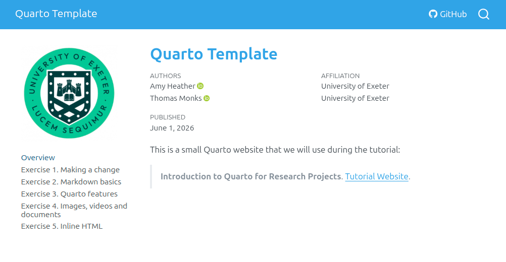
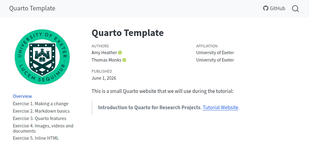
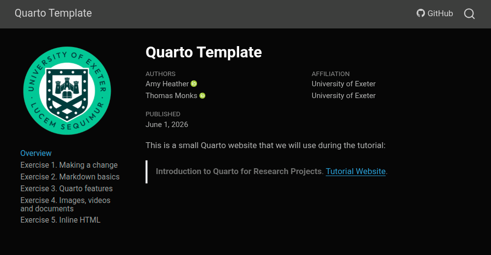
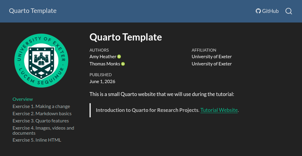
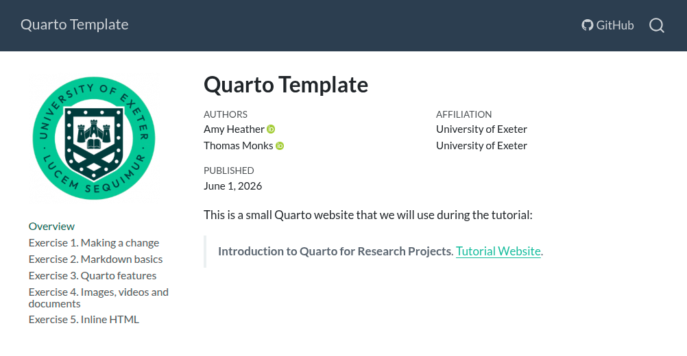
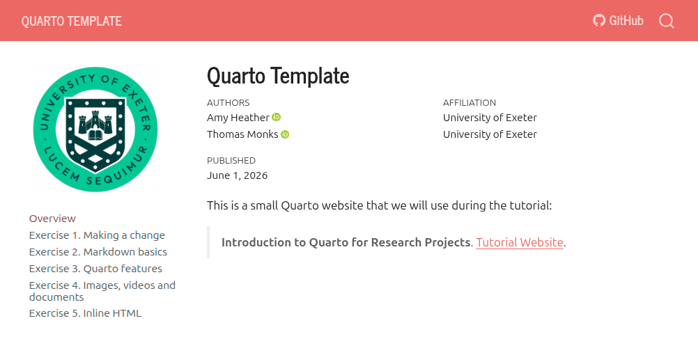
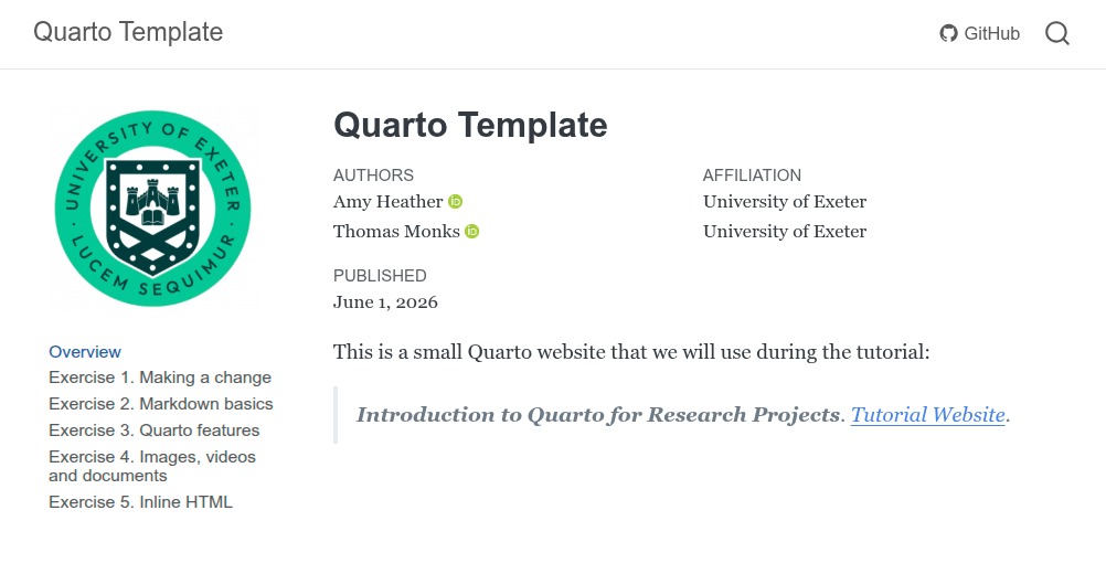
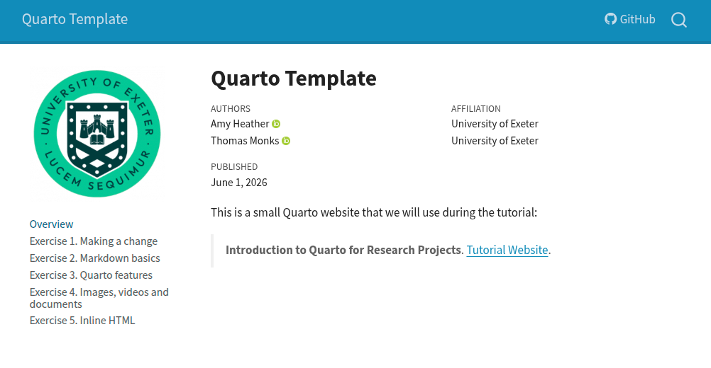
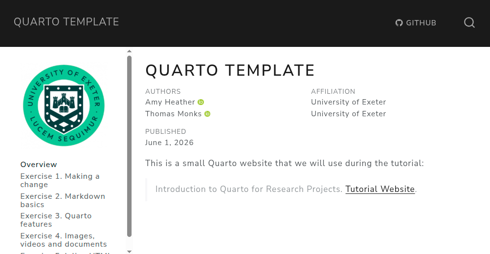
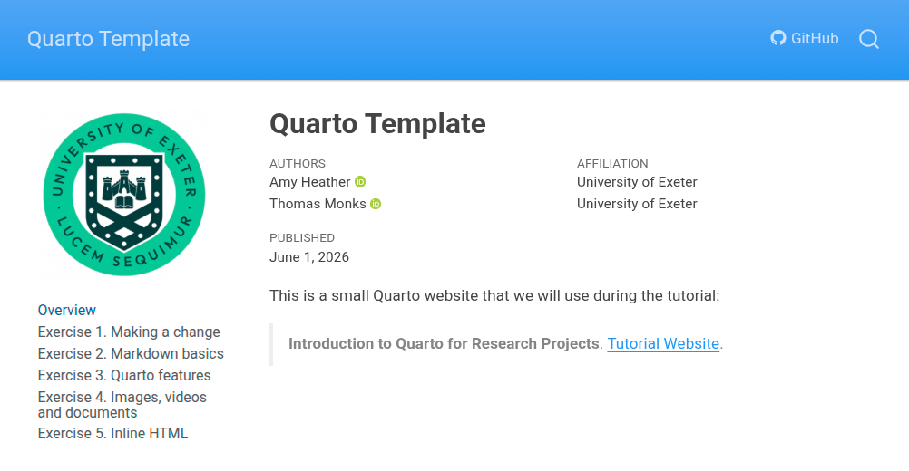
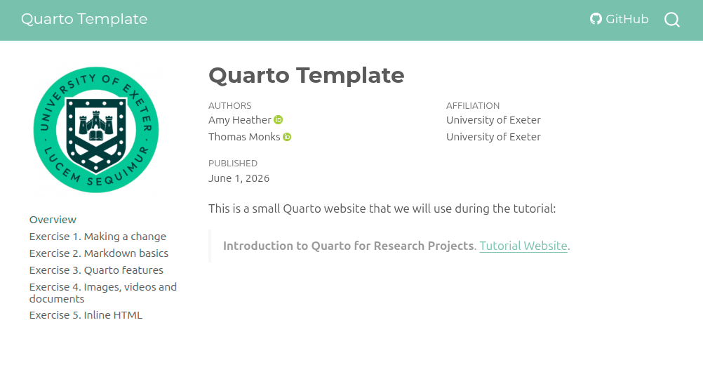
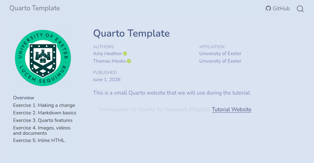
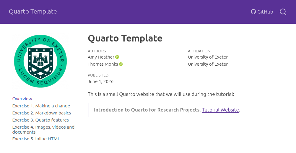
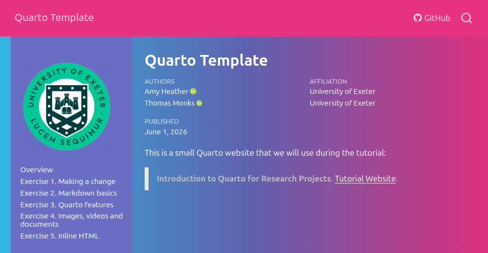
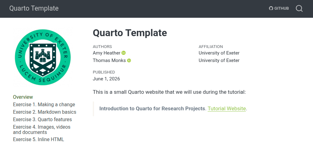
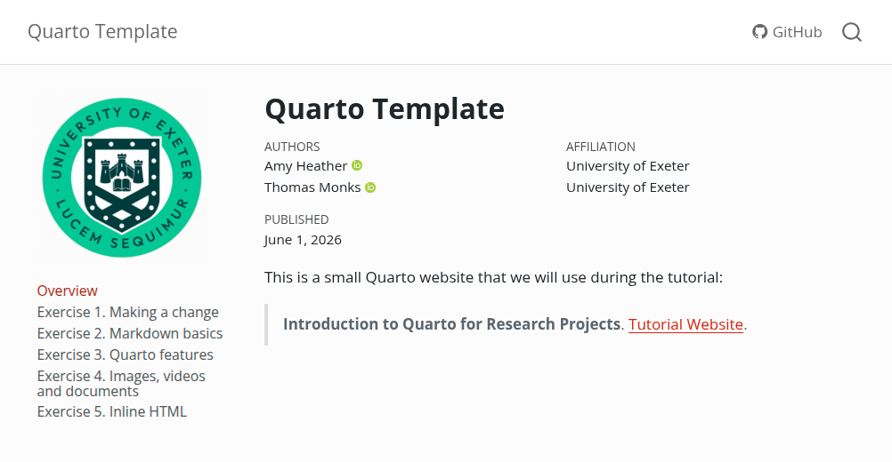
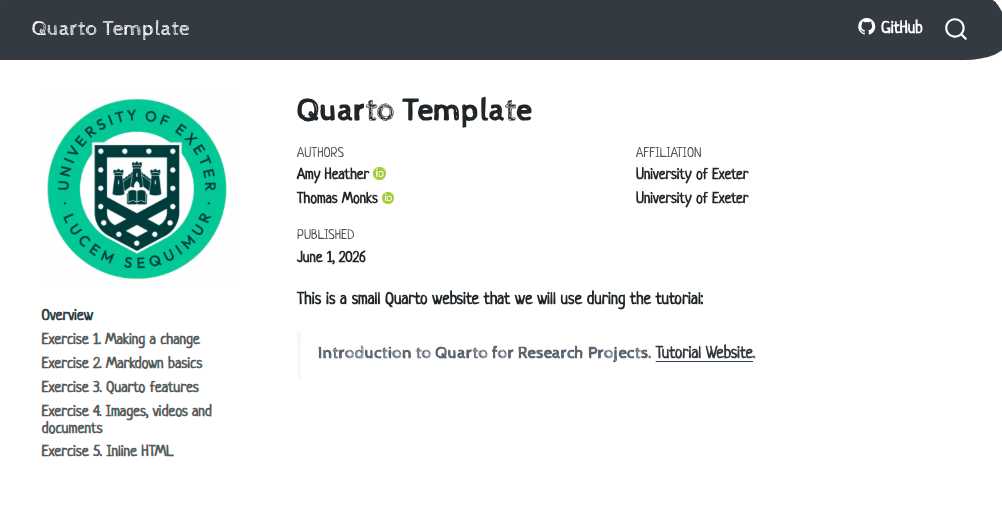
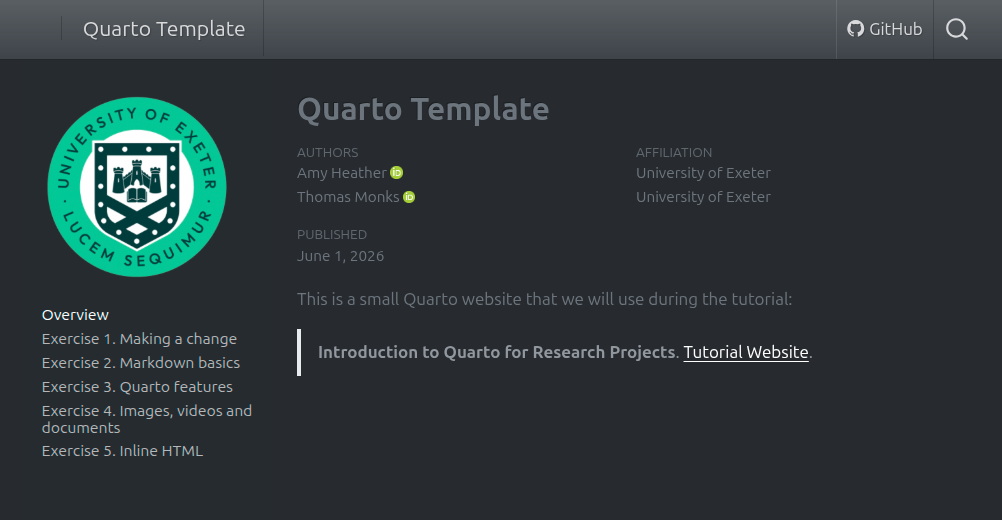
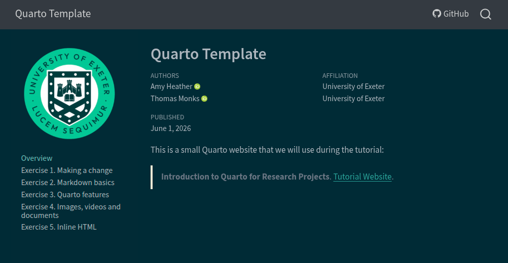
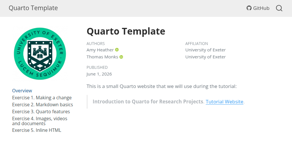
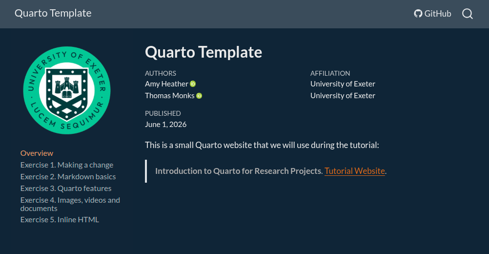
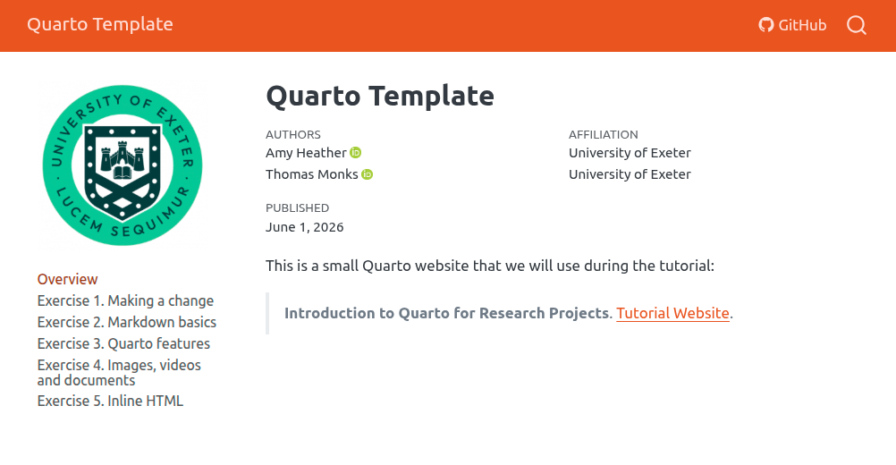
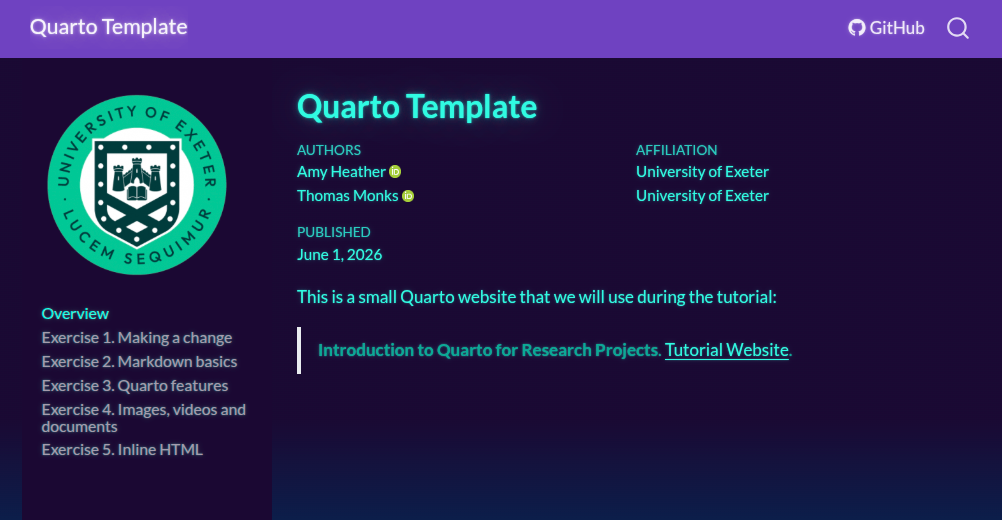
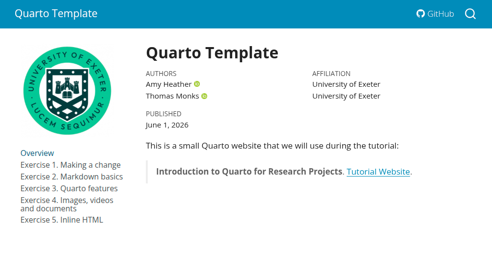
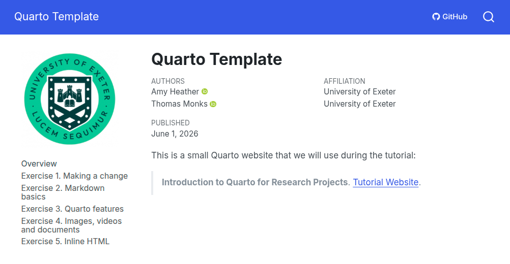
Quarto websites use a theme to control the general look (fonts, colours, spacing). You can view a list of available themes at https://quarto.org/docs/output-formats/html-themes.html.
You can also browse through them below:
Task:
6 Page width
By default, Quarto uses a content width that is comfortable for reading. You can change this layout using the page-layout option.
For example, to make the content span the full width of the page:
format:
  html:
    page-layout: full
You can set this:
- In a single page (inside that page’s YAML front matter, alongside title).
- Or for the whole site (inside
_quarto.ymlunderformat:→html:).
Task:
7 Styled spans
Sometimes you want to highlight just a few words inside a sentence.
You can use inline HTML with a style attribute:
Highlight <span style="background: yellow;">this bit</span>.Output: Highlight this bit.
Task: