Working on Table 3, Figure 3 and Appendix 6 (none yet reproduced). Total time used: 14h 8m (35.3%).
09.36-09.48: Revisiting Table 3
Reflection
I’ve been finding this quite tricky/slow to get my head around, and want to acknowledge that part of the reason for that will be that this is a complex model subject and - though having studied and done a little work in health economics - I am not a health economist.
There are some things that might have helped though, such as having a clear indicator of which columns and outputs match up with the paper, as its still taking me a while to make sure I’m looking at the same ones, particularly as the results don’t match up.
Continuing from yesterday, when I’d realised that incremental costs and QALYs that subjectively look really similar actually result in really different ICERs, I explored the possibility that the difference in results is actually just down to the number of agents.
Looking in their GitHub commit history, I found results from them running with 1 million base agents (like me here):
Comparing those against Table 3, they are very different from them, and from me as well. This was despite having set the seed to 333, so it appears the seed control might not be working as expected, whether that be my fault for any changes or just in general.
However, their latest results (from 50 million agents) still look quite different to the original, e.g. S1b 3yr ICER $31075/QALY in their repository versus $25,894/QALY in the paper.
Hence, I’m wary that running with 50 million agents on my machine - even if I could - still might not get me the same results.
Reflection
Uncertain on if seed control implemented properly. Also, here, it appears that either the number of agents can’t be reduced to get same results, and that a really high number are needed for stability, or that its actually just a seed issue.
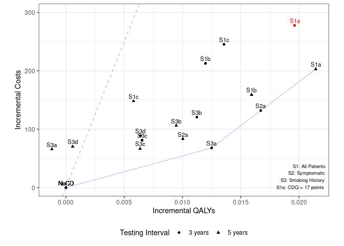
09.49-10.40: Working on Figure 3
Taking a break on Table 3, I looked to Figure 3. The current model code does output two visually similar figures, and it appears I would just need to combine these to get the figure from the paper. This was very easy to get started with - just copying it over, but tweaking to add a grouping for 3 years and 5 years.
I add the efficiency frontier based on the description in the text - looking for lowest cost-effectiveness ratio, and then ruling out strategies that were less effective with a higher ICER. I’m not 100% certain I’ve implemented it correctly, but certainly, it looks different any since the points are all different.
Figure 3 Attempt
Reflection
Was really helpful having partial code for figures, but full code would have been fab (as e.g. I was uncertain if I’m implementing efficiency frontier correctly).
11.00-11.11: Troubleshooting difference in results
I stuck with Table 3 and Figure 3, trying to figure out the reason for the differing results.
I checked whether the incremental costs and QALYs were based on the adjusted or unadjusted results and, from trying a calculation manually, could see it definitely uses the adjusted.
I looked through the history of some results in their GitHub, just to help clarify to myself the discrepancies I’m seeing v.s. what they see.
This reaffirms to me - again - that the problem is likely agent number, and so the best course of action would be to run it with 50 million (like their repository) and potentially even 100 million (like their paper), although I’m not sure if our computer will be capable of it.
11.12-11.18: Running one scenario with 50 million
I remade a mini analysis file with a single scenario, so we can test how long the run takes without trying to run all at once.
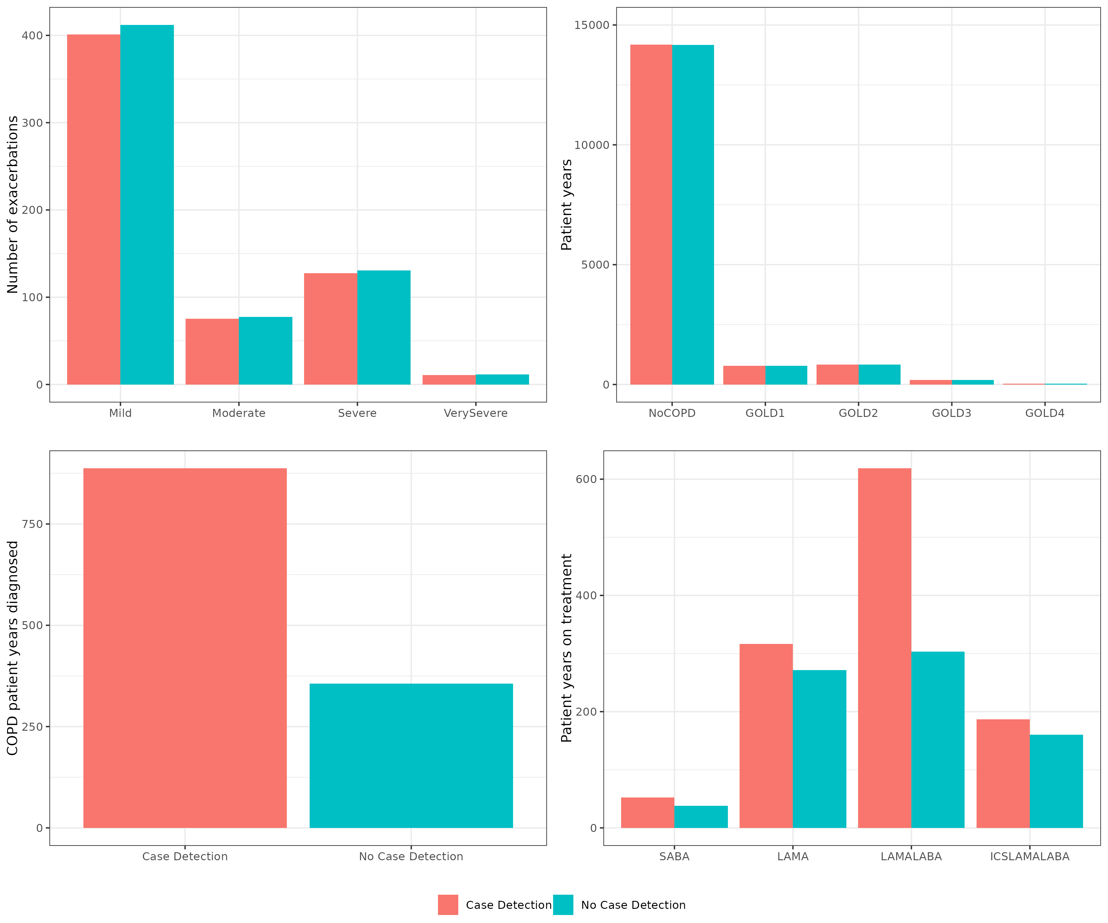
11.24-12.15: Appendix 6
Appendix 6 presents the clinical results from S1a 3 yrs. I couldn’t spot code for these figures in the closedcohort .Rmd files. I could see the package itself had plotting functions in figures.R and some of these appeared potentially relevant. This appeared to need to be called whilst running the model (rather than using the model outputs we had saved to csv).
I made a new .Rmd file to run S1A, reduce from 1e6 to 50000 just while testing. Looking through the package, it wasn’t immediately clear to me how/when to call the export_figures() function. I tried adding it after all the S1A code. This had error:
Error in `cost_by_GOLD[, 2:5] <- (op_ex$cumul_cost_gold_ctime[, 2:5])`:
! number of items to replace is not a multiple of replacement length
Backtrace:
 1. epicR::export_figures()
I tried instead putting it before s1a’s terminate_session(), but the error persisted.
I tried a different approach, to instead manually copy of the relevant code from export_figures() so I can altered it more closely and figure out why its breaking. Looking at the function, it was running the model itself and using:
data <- as.data.frame(Cget_all_events_matrix())
op <- Cget_output()
op_ex <- Cget_output_ex()
I then realised that actually, the results we need might just be in the output S1.csv, and that these figures are more complicated than we require, so I instead looked to make them manually.
There are columns with Mild, Moderate, etc. counts but this needs to be transformed to per 1000. I wasn’t sure whether to:
Divide by 1000 (as 1 million / 1000 = 1000)
Use the “PY” results and multiply by 1000 (as that appears to be a bit like what they do in export_figures() although not super sure)
Each of the two methods came out with different results. I searched in the repository but couldn’t find anything about MildPY or the others, so decided to go with the non-PY method, since I wasn’t actually sure what PY stood for, and whether it might actually be to do with “pack years” or “patient years”.
Doing it manually, I made the first of the four figures, and found it actually looked very visually similar to the original, even if the number of exacerbations was lower. I suspected this was an issue with my adjustments. Looking at s1.csv, the Agents are actually lower than the base agents we set (apx 700k v.s. 1m). I tried using that to adjust - and that worked out much closer.
13.15-13.20, 13.25-13.28: Result from 50 million
To run S1NoCD with 50 million base agents, it took 1.644506 hours (1 hour 38 minutes)
There’s 24 scenarios, so running those with 50 million would take apx. 1 day 15 hours 28 minutes. With 100 million (as in the paper), it would be at least double that (so at least 3 days 7 hours).
That’s repeated a total of 8 times, for the reference case and then for the scenario analyses (so, 26 days 8 hours).
It appears we may therefore need to explore access to a HPC.
The result was:
import pandas as pdpd.read_csv('s1NoCD_50mil.csv')
Scenario
Agents
PatientYears
CopdPYs
NCaseDetections
DiagnosedPYs
OverdiagnosedPYs
SABA
LAMA
LAMALABA
...
NoCOPD
GOLD1
GOLD2
GOLD3
GOLD4
Cost
CostpAgent
QALY
QALYpAgent
NMB
0
S1NoCD
37196486
6.259536e+08
7.111802e+07
190966216
1.316646e+07
13371458
0.017152
0.135457
0.151286
...
527427474
28845970
30727603
6872520
1191666
7.986489e+10
2147.108537
4.666148e+08
12.544592
625082.515224
1 rows × 29 columns
13.30-14.42: Returning to appendix 6
I created the four figures. For the fourth, the transformation I’d done to make it reflect 1000 didn’t seem to make sense for that one, but I wasn’t quite sure what the data was or how to transform it.
I tried multiplifying by 1000, and that got results about half of the original. I tried multiplifying by 2000 - although this is just a total guess at this point.
Looking across the results, I would say that I am satisified this matches the original for all except one bar: SABA. The SABA bars for patient years on treatment are much lower than in the original figure.
Appendix 6 attempt
SABA is one of the treatments: short-acting beta-agonists.
I went to check my results, then realised there was an adjusted table of clinical results, and that I should try using that instead of S1, which is the more “raw” model results. Notably, that table just seems to have the columns used in the appendix plot - and they are adjusted to be per agent, so I can confidently just multiply by 1000 to get results for 1000 people.
Reflection
It’s great that this was provided, and makes it much easier. This is partly my fault for not noticing that I should be using that table. However, as for the other parts of this reproduction, this might have been supported by more guidance on which tables produced which figures, or inclusion of code to produce that figure in the paper. And, I wasn’t sure what to multiply for these either in the end (see below).
I realised that multiplying by 1000 works with pAgent columns, but not for the pPYAll. It seems I’d need to multiply by about 16,000.
I experimented with the others, but these were just guesses of what to multiply by, and I still found SABA results to be too low.
Comparing to other SABA results (with LAMA for context):
Scenario
My SABA (LAMA)
Their 50 million SABA (LAMA)
S1NoCDAvg
0.019 (0.136)
0.019 (0.135)
S1a
0.026 (0.159)
0.026 (0.159)
Given how similar these results are, I’m suspecting the issue might not be with the result, but with my transformation, as I just guessed at multiplying it all by 2000 to get similar-ish results for some bars. Looking at Case_Detecetion_Results.Rmd, SABAAll was created as follows:
ProppPatientYears adjusts the years for scenarios 2 and 3 by dividing them by the patient years of S1NoCDAvg. For scenario 1, it just sets this value to 1. This appears to be some adjustment of scenarios 2 and 3 so they compare against a single reference population. However, it remains unclear to me quite what the units are. SABAAll works out the same for scenarios 1 as SABA.
Reflection
Found these transformations tricky to work out. I think part of the difficulty is that I’m really not quite sure what these columns are, and there isn’t documentation/comments to explain it, so I then don’t know how to transform them to match up with the paper.
I then tried looking at the COPD DiagnosedpPY results, since those are the same thing just not broken down by treatment, and since clinical gives us adjusted versions of these but we also have “raw” versions from s1.
You can convert between the two by multiplying by about 1910, but that doesn’t work for SABA.
Instead, I tried looking back at export_figures() and the paper each again, but struggled to spot any answers there. I then tried looking at the first EpicR paper, “Development and Validation of the Evaluation Platform in COPD (EPIC): A Population-Based Outcomes Model of COPD for Canada”, but couldn’t find anything to explain it there either.
I then looked to the main epicR repo, and found it has some documentation in the docs/ folder. I opened and read the html files in docs/articles/, but struggled to find answers here too.
Timings
import syssys.path.append('../')from timings import calculate_times# Minutes used prior to todayused_to_date =588# Times from todaytimes = [ ('09.36', '09.48'), ('09.49', '10.40'), ('11.00', '11.11'), ('11.12', '11.18'), ('11.24', '12.15'), ('13.15', '13.20'), ('13.25', '13.28'), ('13.30', '14.42'), ('15.10', '15.40'), ('15.47', '16.06')]calculate_times(used_to_date, times)
Time spent today: 260m, or 4h 20m
Total used to date: 848m, or 14h 8m
Time remaining: 1552m, or 25h 52m
Used 35.3% of 40 hours max