Reproduced Figure 5 and working on Figures 2 and 4. Total time used: 23h 29m (58.7%).
10.45-11.00, 11.35-11.45: Running model with 30 replications and various seeds
Intermittently (condensed to 15 minutes, but was over a longer time) ran the baseline model with several different seeds, but 30 replications. However, we can see this has a fairly minimal impact on the results, with a fairly low peak observed for the AngioINR waiting times in all.
Figure 2A with different seeds
12.00-12.17: Working on Figure 2B
Figures 2A and 2C have lower angioINR wait times but are otherwise fairly similar to the scope. However, Figure 2B is very different. It should have higher angioINR and angio staff wait times.
I tried a few variants to see how they impacted results, although none got us what we are hoping for:
Changing the number of angioINR machines
Excluding emergency IR patients
Doubling the number of ED arrivals
Reducing the number of angio staff (did bring up the curves, but too high, and as they are normally requested as 3 at a time, as soon as go to 6, the wait times drop again)
Reducing the number of ED staff
Increasing the INR angioINR appointment length to mean 120 SD 60 (from mean 60 SD 30)
Force emergency IR to only use angioINR (and not angioIR)
12.20-12.24, 13.13-13.29, 13.39-13.44: Evaluating in-text result 3
Given that in-text result 2 now matches up due to the fix to the double angioINR scenario, I also checked the results for in-text result 3. These complement figure 3, but provide the reduced wait times for some of the scenarios (excludes exclusive use). These are changes to wait time in min.
The fix to the model has definitely improved the two angioINR results (previously -2.1 and -2.2) but still are both dissimilar to the paper.
I have previously tried running different seeds for baseline, which caused alot of fluctation in results (and although not similar to the original, I do think it could be possible to get closer if I just tried some more different seeds!). I tried also running the seed variants for the angioINR scenarios, to see what sort of fluctuation we get in those results - as if that looked to get us slightly closer, then I’d be convinced to try some more seeds for both of them (takes a little while to run, so was only planning to do if looked hopeful).
However, they do all still look rather different, with nothing very similar to the paper. Hence, feel there might be another underlying cause for the differences (beyond seeds) (particularly as haven’t got related figure to match).
Scenario
Paper reduction
My reduction (seed 200)
(seed 500)
(seed 700)
Baseline 1h extra
-1.7
-1.47
-1.8
-2.2
Baseline 2h extra
-0.9
-1.47
-1.8
-3.2
AngioINR 1h extra
+1
-0.4
-0.57
-0.43
AngioINR 2h extra
+0.3
-0·92
-1.1
-0.76
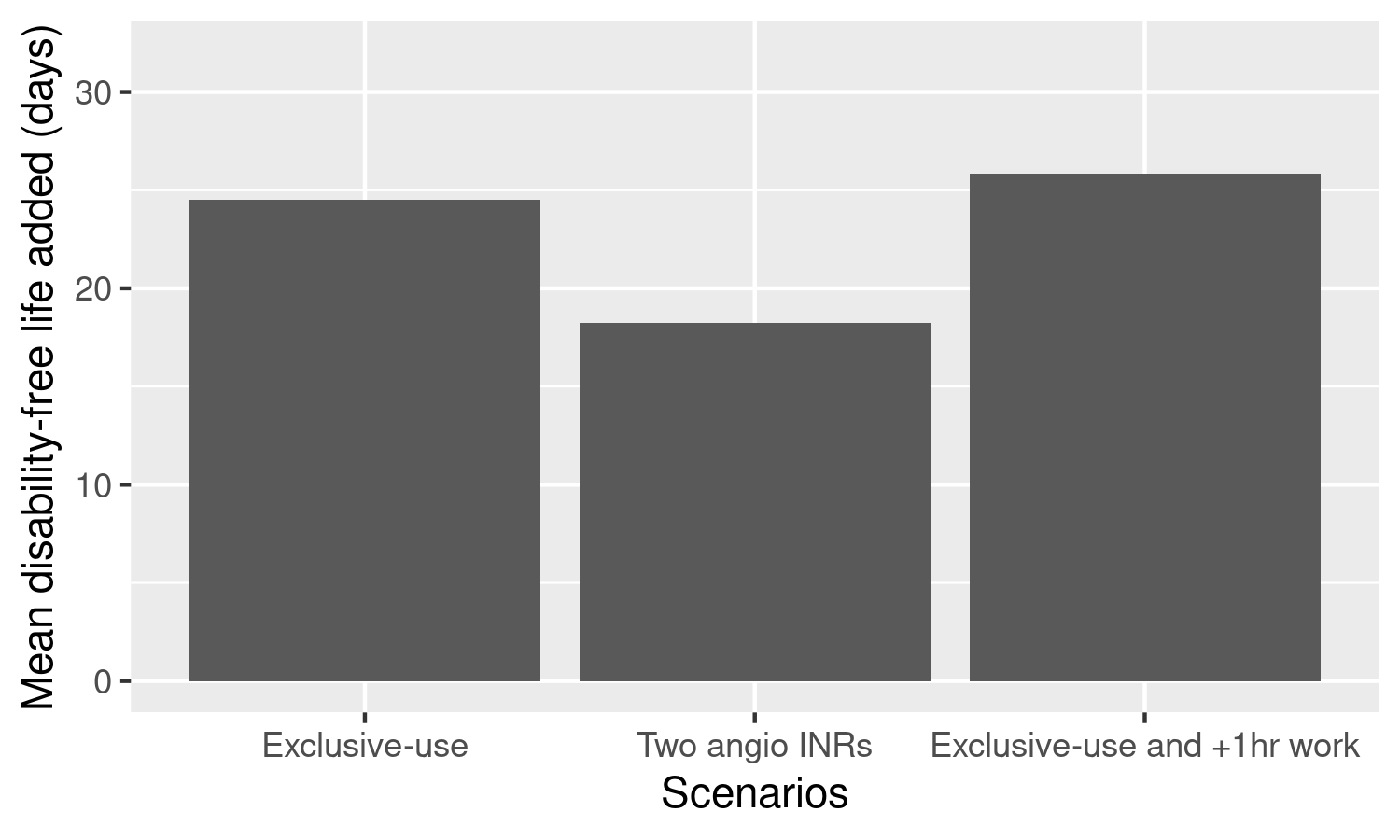
13.45-13.54, 14.00-14.21: Figure 4
This figure uses the reduction in patient wait times (from baseline) from three scenarios, multiplying the minutes saved by 4.2. With a seed 200 and so average wait for baseline of 14 minutes…
Scenario
Wait time
Reduction from baseline (14 min)
Disability-life years added
Exclusive use
8.12
- 5.84
24.528
Two angioINRs
9.62
-4.34
18.23
Exclusive use + 1 hour
7.80
-6.20
26.04
Although the exclusive use results look a bit lower than the figure, the pattern is similar and it’s somewhat close, so I worked to create a plot of this within reproduction.Rmd.
Looking at the plot, I think the results are reasonably similar (middle one definite!), but the right bar may just be a bit too different (-5 ish).
Figure 4
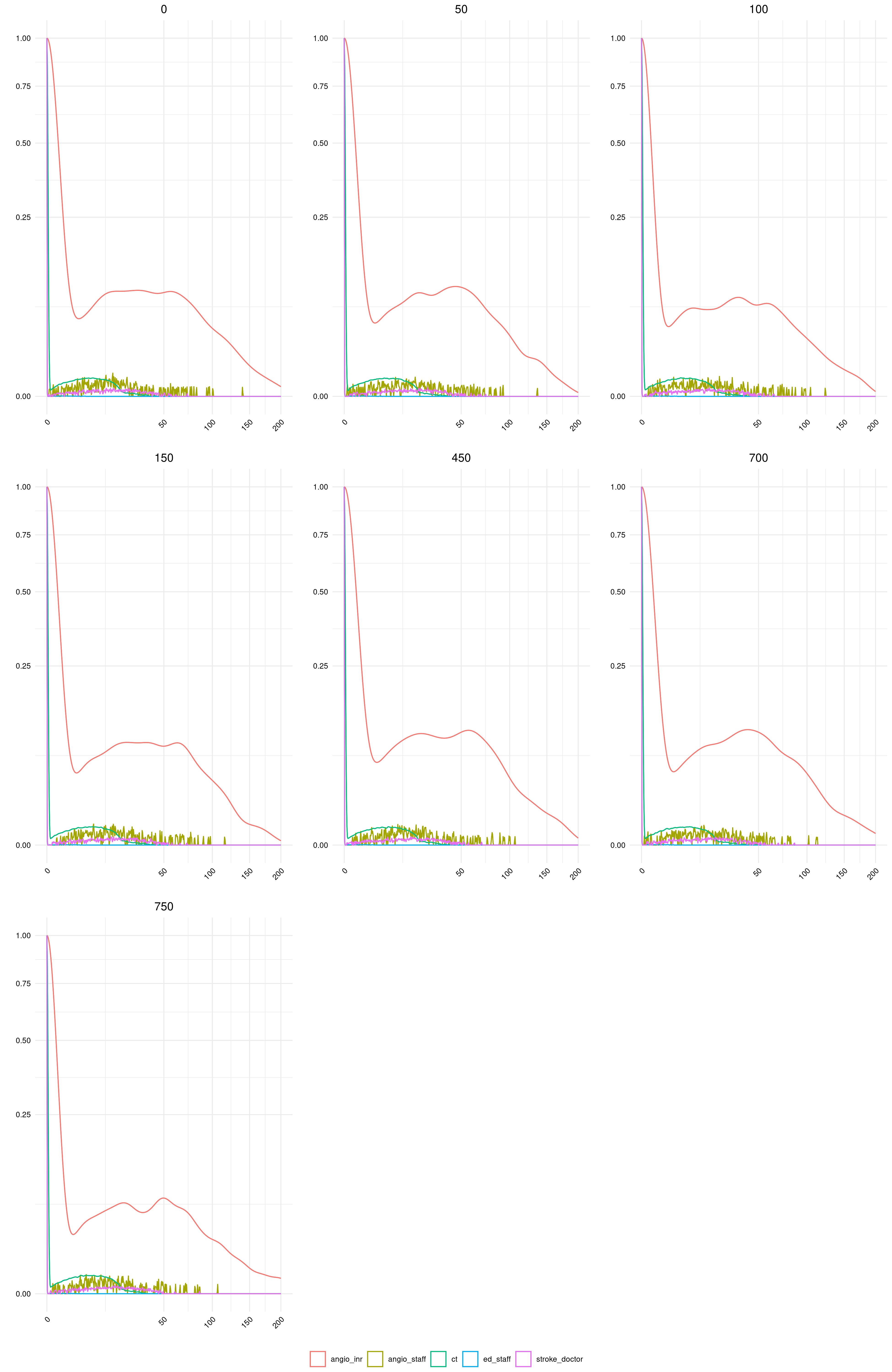
15.32-16.31, 16.35-17.00: Figure 5
Don’t save full model results due to file size, so had to re-run the three basic model scenarios, and then combined and saved the utilisation from angioINR.
I realised that the plot looks very similar to those from the simmer documentation, so followed those guidelines to produce it (and see code for that function plot.resources.utilizationat this link). However, ordinary import using data.table creates a data.table data.frame, whilst the original from the model is a resources data.frame. This appears to be a custom simmer class, and the plot function does not work otherwise. As I couldn’t figure a way to resolve this, I set it to run the model for this function only, for now, since the original simmer.plot code is not under an open license.
I think the result is very similar to the original - the only difference is that baseline has 24% utilisation instead of 26% - but I feel that is close enough to mark this as successfully reproduced.
Timings
import syssys.path.append('../')from timings import calculate_times# Minutes used prior to todayused_to_date =1228# Times from todaytimes = [ ('10.45', '11.00'), ('11.35', '11.45'), ('12.00', '12.17'), ('12.20', '12.24'), ('13.13', '13.29'), ('13.39', '13.44'), ('13.45', '13.54'), ('14.00', '14.21'), ('15.32', '16.31'), ('16.35', '17.00')]calculate_times(used_to_date, times)
Time spent today: 181m, or 3h 1m
Total used to date: 1409m, or 23h 29m
Time remaining: 991m, or 16h 31m
Used 58.7% of 40 hours max