import pandas as pd
import matplotlib.pyplot as plt
from dataclasses import dataclass
import os
import numpy as npReproduction
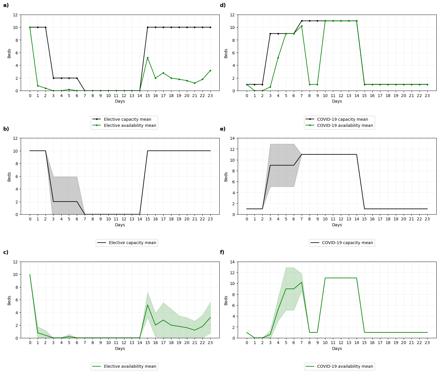
This notebook aims to reproduce Figure 3 from Anagnostou et al. 2022.
The run time for this notebook is a couple of seconds.
Set-up
Import required packages
Set file paths
@dataclass(frozen=True)
class Paths:
    '''Singleton object for storing paths to data and database.'''

    outputs = '../output'
    model = 'OUT_STATS.csv'
    figure = 'fig3.png'


paths = Paths()
Run model
%run ./main.py -z ../input/ZONES.csv -p ../input/ICU_INPUT_PARAMS.csv -c ../input/DAILY_ARRIVALS.csv -o ../output/OUT_STATS.csv Replication 1 out of 5
Replication 2 out of 5
Replication 3 out of 5
Replication 4 out of 5
Replication 5 out of 5Import model results
data = pd.read_csv(os.path.join(paths.outputs, paths.model))
data.head()| day-mean | day-s | day-sd | day-ci | emArrivals-mean | emArrivals-s | emArrivals-sd | emArrivals-ci | elArrivals-mean | elArrivals-s | ... | zone7-available-sd | zone7-available-ci | zone8-type-mean | zone8-type-s | zone8-type-sd | zone8-type-ci | zone8-available-mean | zone8-available-s | zone8-available-sd | zone8-available-ci | |
|---|---|---|---|---|---|---|---|---|---|---|---|---|---|---|---|---|---|---|---|---|---|
| 0 | 0.0 | 0.0 | 0.0 | 0.0 | 10.8 | 48.8 | 3.492850 | 3.061618 | 3.8 | 30.8 | ... | 0.000000 | 0.000000 | 6.0 | 0.0 | 0.0 | 0.0 | 15.0 | 0.0 | 0.000000 | 0.000 |
| 1 | 1.0 | 0.0 | 0.0 | 0.0 | 6.6 | 29.2 | 2.701851 | 2.368277 | 6.0 | 6.0 | ... | 0.000000 | 0.000000 | 6.0 | 0.0 | 0.0 | 0.0 | 15.0 | 0.0 | 0.000000 | 0.000 |
| 2 | 2.0 | 0.0 | 0.0 | 0.0 | 8.8 | 82.8 | 4.549725 | 3.988010 | 5.8 | 6.8 | ... | 2.792848 | 2.448039 | 6.0 | 0.0 | 0.0 | 0.0 | 14.0 | 0.0 | 0.000000 | 0.000 |
| 3 | 3.0 | 0.0 | 0.0 | 0.0 | 5.4 | 83.2 | 4.560702 | 3.997631 | 4.0 | 26.0 | ... | 1.673320 | 1.466730 | 6.0 | 0.0 | 0.0 | 0.0 | 15.0 | 0.0 | 0.000000 | 0.000 |
| 4 | 4.0 | 0.0 | 0.0 | 0.0 | 4.6 | 57.2 | 3.781534 | 3.314661 | 4.2 | 14.8 | ... | 1.095445 | 0.960200 | 6.0 | 0.0 | 0.0 | 0.0 | 14.2 | 0.8 | 0.447214 | 0.392 |
5 rows × 144 columns
Create plot
def add_ci(x, y, error, ax, color, alpha):
    '''
    Add shaded confidence interval to a subplot

    Parameters:
    -----------
    x : column
        Column being plot on x axis
    y : column
        Column with mean values being plot on y axis
    error : column
        Column containing confidence interval for mean on each day
    ax : matplotlib axis object
        Axis to add confidence interval to
    color : string
        Color of shaded confidence interval
    alpha : number between 0 and 1
        Transparency of shaded confidence interval
    '''
    ax.fill_between(x, y-error, y+error, color=color, alpha=alpha)
# Set up number of subplots and figure size
fig, ax = plt.subplots(3, 2, figsize=(15, 13))
# Mean lines
ax[0,0].plot(data['el-capacity-mean'], color='black', marker='.',
label='Elective capacity mean')
ax[0,0].plot(data['el-available-mean'], color='green', marker='.',
label='Elective availability mean')
ax[1,0].plot(data['el-capacity-mean'], color='black',
label='Elective capacity mean')
ax[2,0].plot(data['el-available-mean'], color='green',
label='Elective availability mean')
ax[0,1].plot(data['c-capacity-mean'], color='black', marker='.',
label='COVID-19 capacity mean')
ax[0,1].plot(data['c-available-mean'], color='green', marker='.',
label='COVID-19 availability mean')
ax[1,1].plot(data['c-capacity-mean'], color='black',
label='COVID-19 capacity mean')
ax[2,1].plot(data['c-available-mean'], color='green',
label='COVID-19 availability mean')
# Add confidence intervals
add_ci(data['day-mean'], data['el-capacity-mean'], data['el-capacity-ci'],
ax=ax[1,0], color='black', alpha=0.2)
add_ci(data['day-mean'], data['el-available-mean'], data['el-available-ci'],
ax=ax[2,0], color='green', alpha=0.2)
add_ci(data['day-mean'], data['c-capacity-mean'], data['c-capacity-ci'],
ax=ax[1,1], color='black', alpha=0.2)
add_ci(data['day-mean'], data['c-available-mean'], data['c-available-ci'],
ax=ax[2,1], color='green', alpha=0.2)
# Set tick frequency and axis limits for subplots
plt.setp(ax, xticks=np.arange(0,24), ylim=(0,12), yticks=np.arange(0,14,2))
ax[1,1].set_ylim(0,14)
ax[1,1].set_yticks(np.arange(0, 16, 2))
ax[2,1].set_ylim(0,14)
ax[2,1].set_yticks(np.arange(0, 16, 2))
# Loop through the axis objects
i = 0
letter = ['a', 'd', 'b', 'e', 'c', 'f']
for ax in ax.flat:
# Add grid
ax.grid(True, alpha=0.2)
# Add X and Y axis labels
ax.set_xlabel('Days')
ax.set_ylabel('Beds')
# Add a legend below the plot
ax.legend(bbox_to_anchor=(0.7, -0.3))
# Annotate with a) - f), only including in tight_layout() for first two
an = ax.annotate(f'{letter[i]})', xy=(-0.09, 1.1),
xycoords='axes fraction', fontsize=13, weight='bold')
if i >= 2:
an.set_in_layout(False)
i += 1
# Prevent overlap between subplots
plt.tight_layout()
# Save the figure
plt.savefig(os.path.join(paths.outputs, paths.figure))
plt.show()